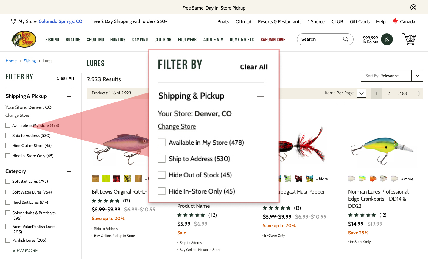
Amids a rush to get to market, digestible application statuses were not a priority among stakeholders. As a result merchants had sub-par visiblity into customer application progress, because system-provided statuses were vague and technical.
Product Design Leader & Senior IC

With 10+ years experience and as the founding designer of a $300M fintech
startup, I am seeking leadership or lead designer opportunities. I’ve delivered 50+
successful features and led teams of designers and researchers.
As a working manager, I lead with trust and empathy while staying close to the
design work. As Director of Product Design and Analytics at Momnt (and the fourth
employee) I built the design team and system from the ground up as the company
scaled to 100+ employees and nearly $1B in annual loan volume.
I believe great design leadership means elevating others, fostering collaboration,
and using data to guide decisions and measure success.
Thanks for taking the time to explore my portfolio.
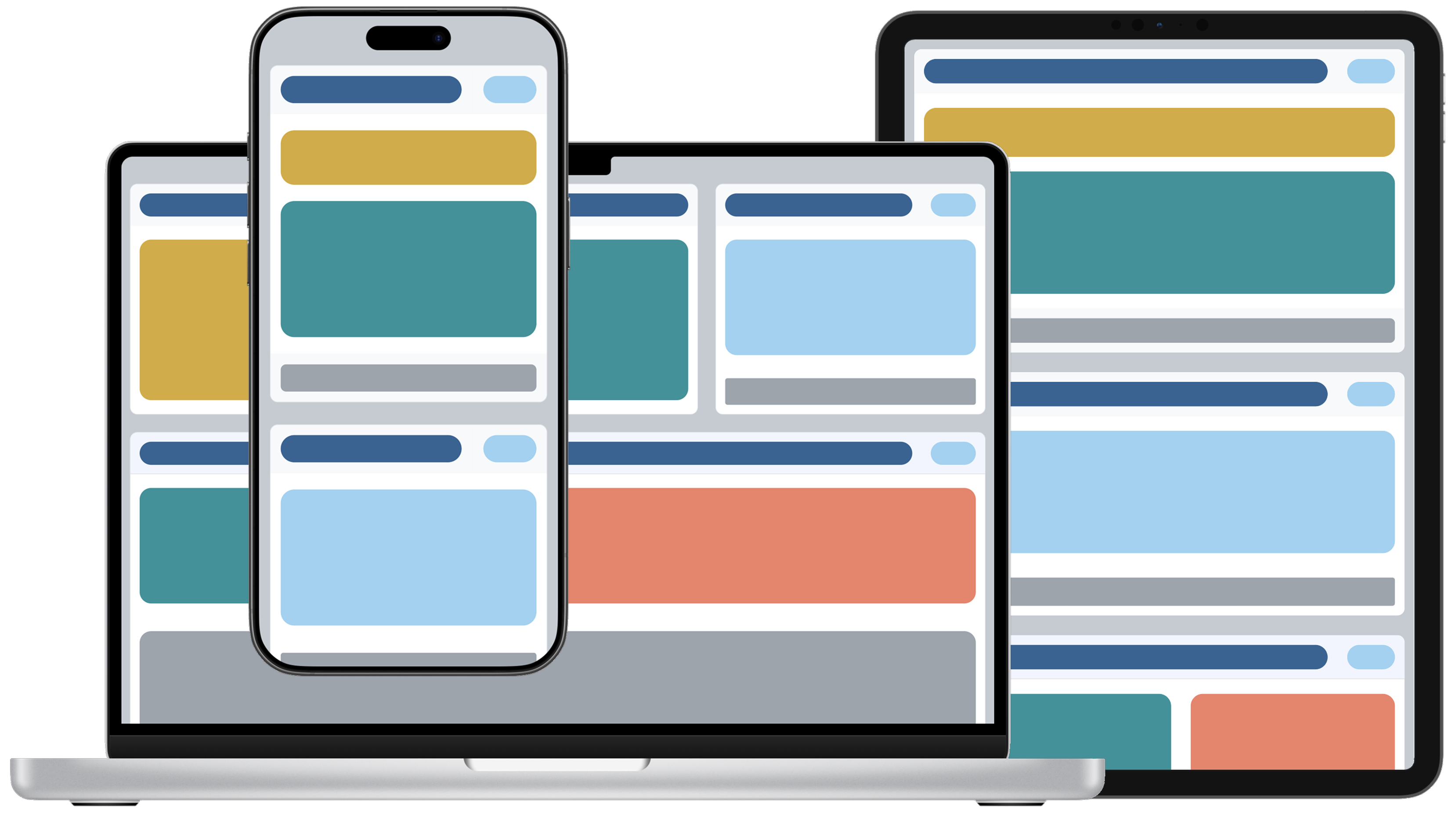
Featured Projects
Momnt
I am the founding designer of this $300M fintech company, eventually building a small design team and large design system. This is my largest body of work, and includes customer-facing & enterprise design.
Bass Pro Shops & Cabela's
This project was a hybrid of browser and mobile app e-commerce redesign during the COVID-19 supply chain crunch. I got to work with a great team on on features deployed across the entire platform.
Chick-Fil-A
Enterprise restaurant management tools for store operators was the focus of this project where we redesigned sections of the company intranet. Chick-Fil-A HQ prioritizes building great things to ensure store operator success.
Finli
Finli is a family-centric fintech app, where I was hired on a fixed budget and timeline to design an MVP version of the app and handoff design assets to engineers.
What is Momnt?
Momnt provides a B2B2C lending platform for home-remodeling contractors. Merchants are risk-scored and vetted during onboarding, while banks and credit unions lend through the platform. Compliance is critical. Revenue comes from merchant fees and selling consumer loans to asset managers.
My Role:I was the founding designer of this fintech company eventually becoming Director of Product Design and Analytics. This is my best work, and includes customer-facing & enterprise design. At Momnt, I built a small team of 3 designers (including myself) and a researcher. We used Fullstory to track user sessions and understand success metrics, and Lyssna (formerly Usability Hub) to test our prototypes.
Accomplishments at Momnt
- Merchant Portal Features
- Loan Application Status Badges - Increased loan acceptance from 61% to 73% by giving Merchants color-coded real-time loan application statuses.
- All Consumers View - Increased loan approval rates from 73% to 81%.
- Payment Calculator - Highly requested sales tool where merchants estimate payments for customers. This resulted in a 14% increase in loan applications overall, and a modest 7% bump in approvals.
- Staged Funding - Risk mitigation tool that reduced merchant–consumer disputes by 21% and lowered delinquent consumer accounts by 12%.
- Custom Merchant Portal Branding - Only offered to high-volume clients, this feature provides major remodeling firms the ability to brand the portal with their own logo and colors. Custom merchant portal branding nearly doubled our merchant base by attracting large merchant networks and now drives about 40% of revenue.
- Merchant Onboarding
- Reduced average time to completion from 17 minutes to 8 minutes.
- Increased completion rate from 63% to 85%.
- Consumer Onboarding
- Loan Offers Design Evolution - loan acceptance rates up by 8%.
- Autopay feature - reduced delinquent accounts by 18% and increased the percetange of Deferred Loan consumers who pay off their loan in promotion from 85% to 96%.
- Design System
- Inputs and Alerts
- Buttons and Selectors
- Progressive Displayers
- Table Component and Related Column Filter Mechanisms
- Enterprise Portal - Internal Tool for Loan
Servicing and Merchant Management.
- Consumer Account View Payment Settings.
- Merchant Account View Staged Funding Configuration.

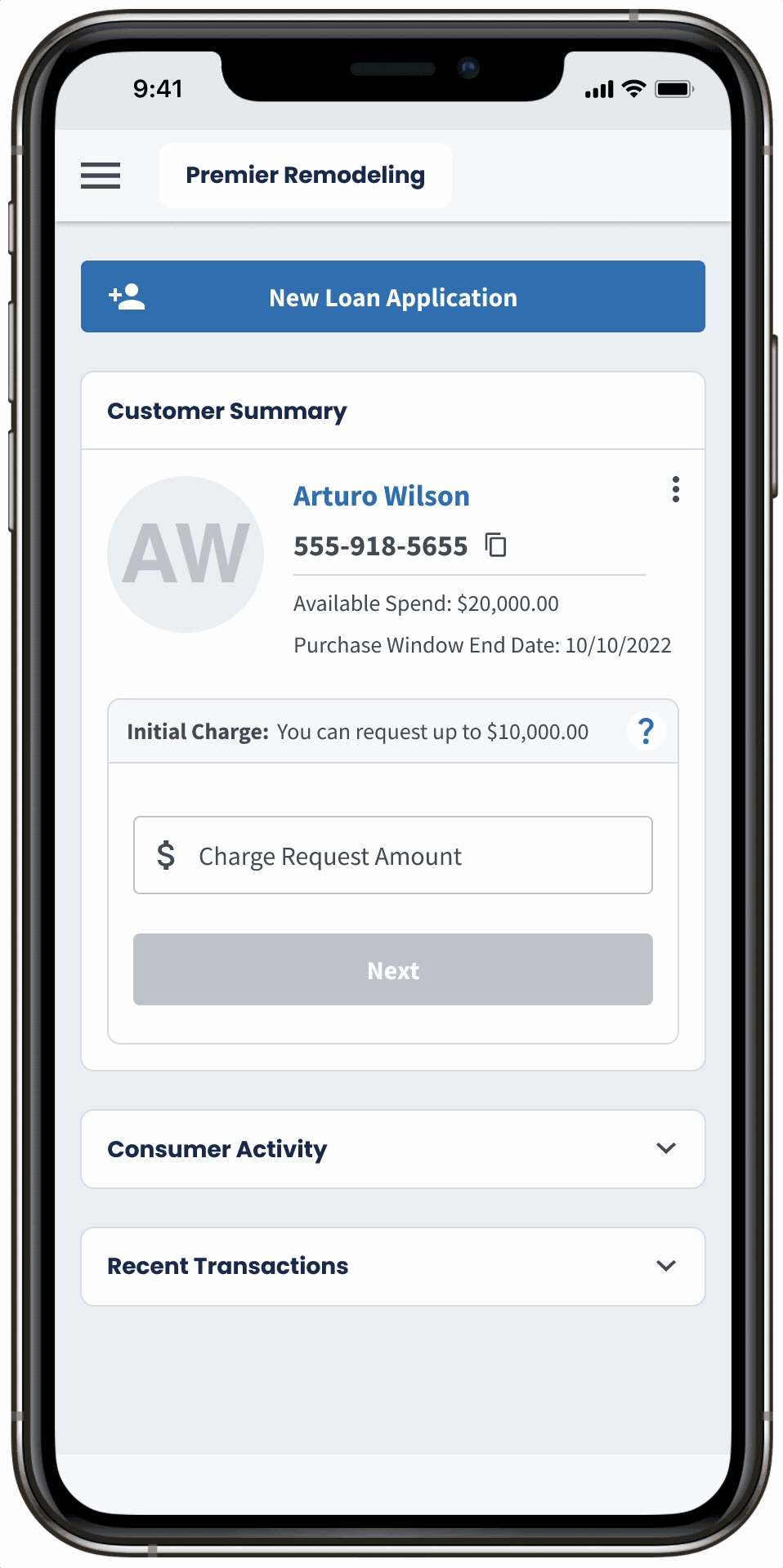
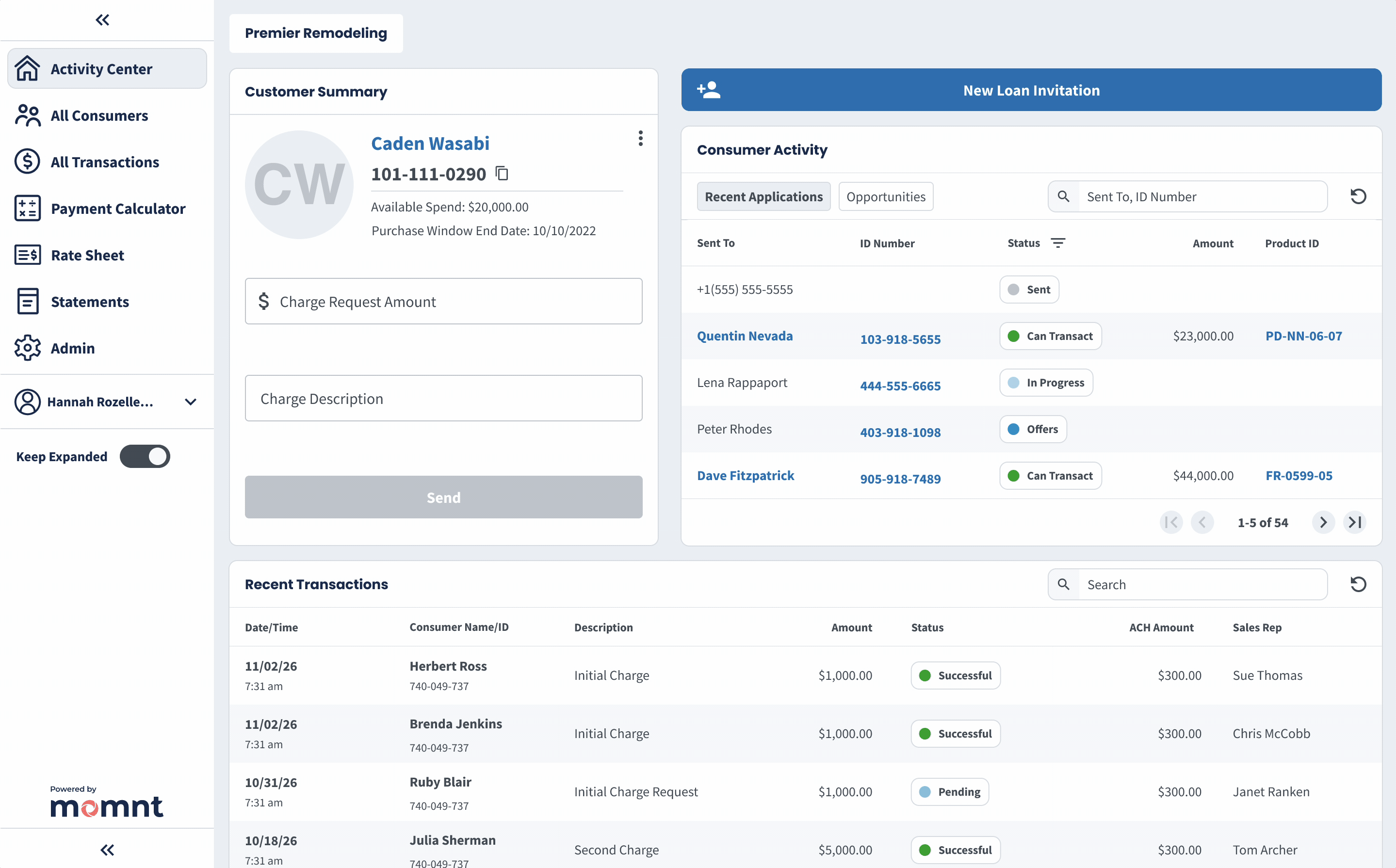
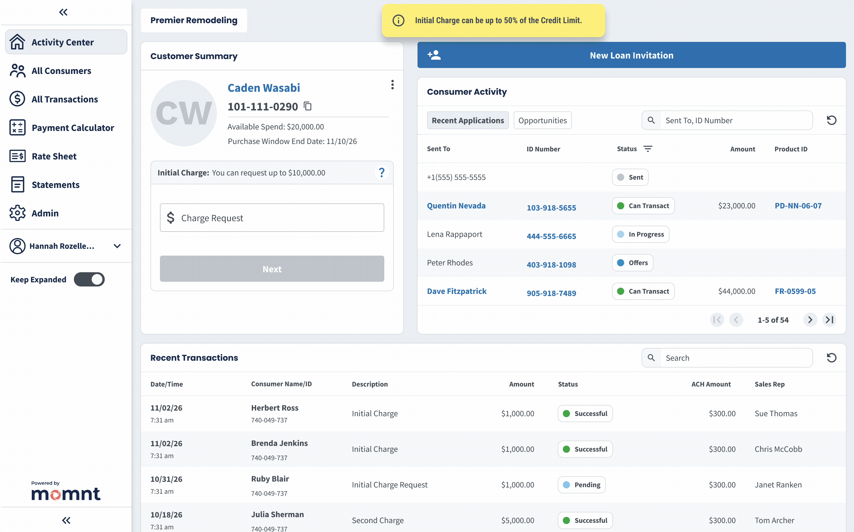
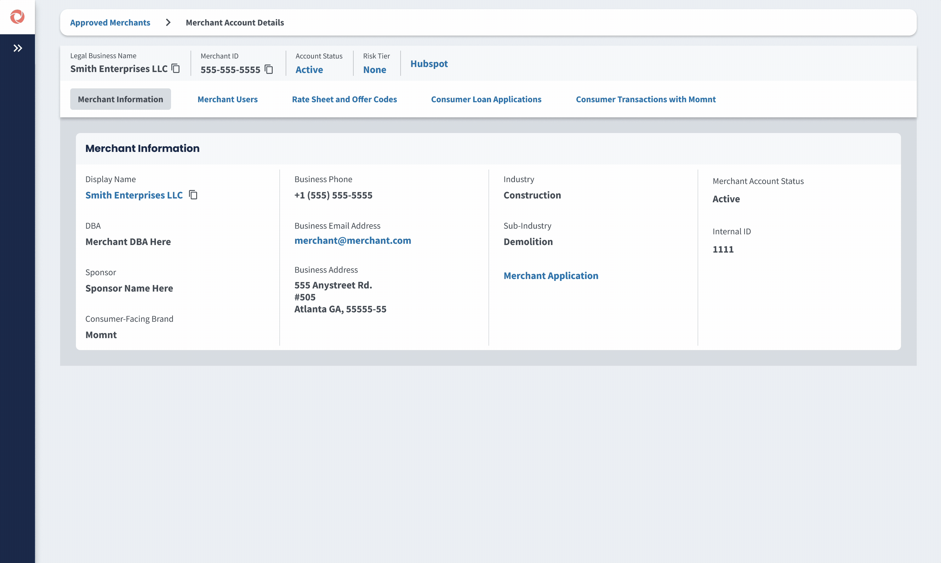
The home screen of the Merchant Portal “Activity Center” is where 90% of user activity occurs. In this example, a user expands and pins the navigation menu, saving it as their default view, then sends a loan application via SMS. The portal uses mostly grayscale colors so clickable elements stand out, the interface feels clean and modern, and large remodelers or resellers can easily apply custom branding (see “Merchant Portal – Custom Portal Branding”).
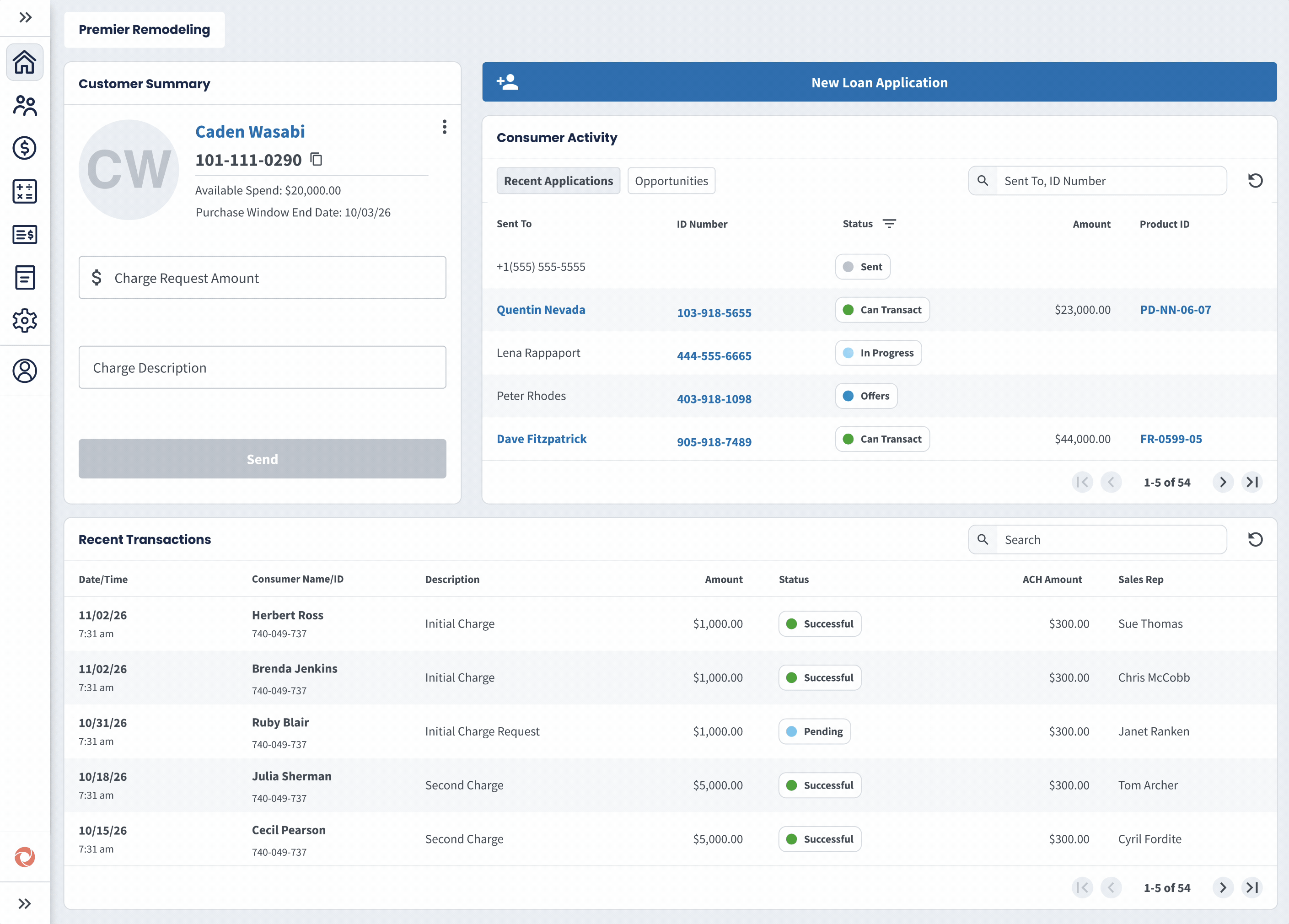
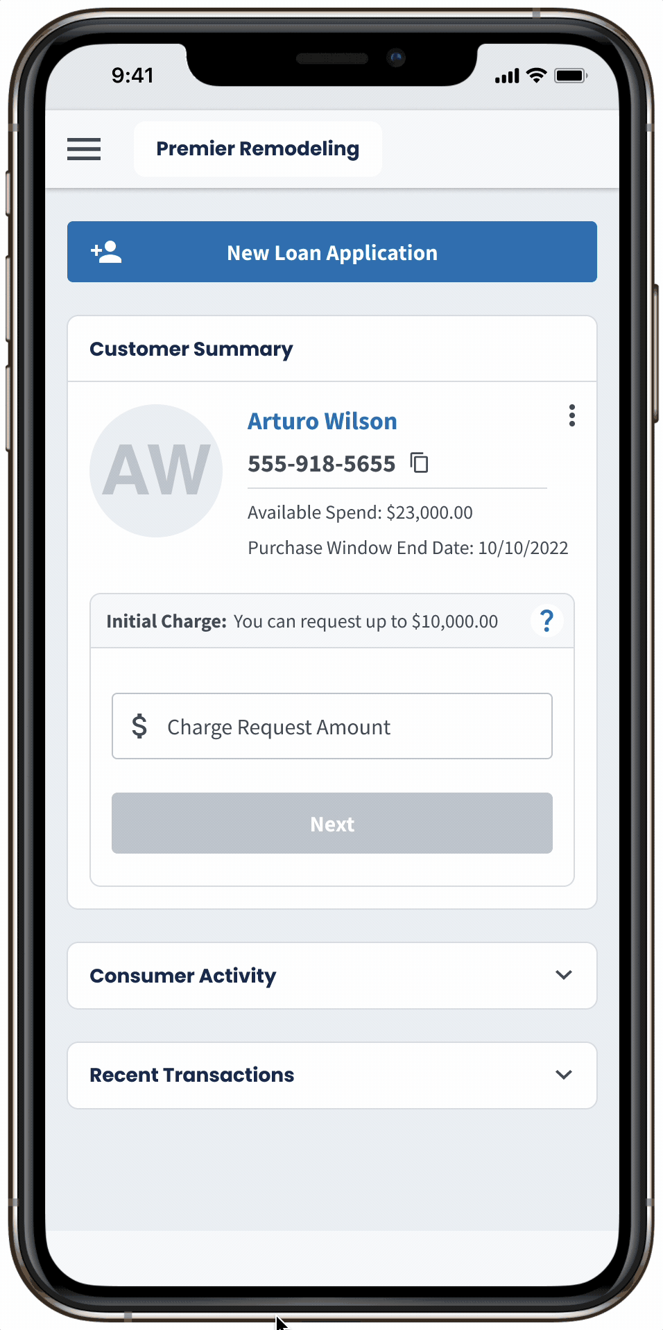
Here is the default view of Customer Summary where a merchant user can send a Charge Request. The consumer is then prompted by SMS and email to log into a Consumer Portal and approve the spend. Below you will see other views of Customer Summary where funding is restricted in stages as part of a feature called Staged Funding that reduces risk.
Merchant Portal Application Status
Badges
Problem
Design Solution
Create interactive color coded application statuses with tooltip explainers, so merchants understand where their consumers are in the application.
Outcome
We saw loan acceptance increase from 61% to 73% as merchants were able to proactively reach out to their customers to help them complete their applications and answer any questions.
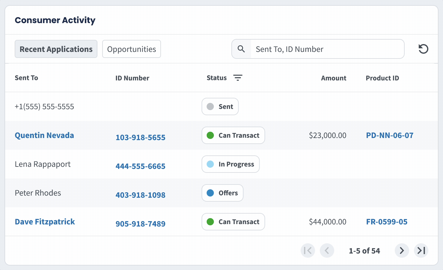
This flow shows a sales rep managing their pipeline on mobile by filtering for “Offers” to identify consumers who were approved but haven’t selected a loan. These customers represent a high-impact follow-up opportunity to address questions and drive conversion.
• View Figma Prototype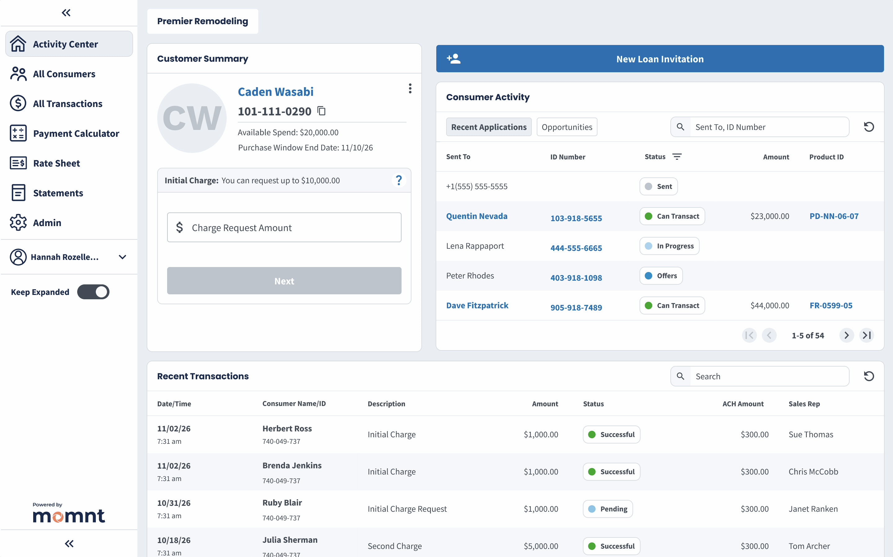
This flow shows an admin ensuring newly approved loan applications receive their initial charge request. By filtering for “Can Transact,” they quickly isolate new customers to send charge requests.
• View Figma PrototypeBefore Application Status Badges
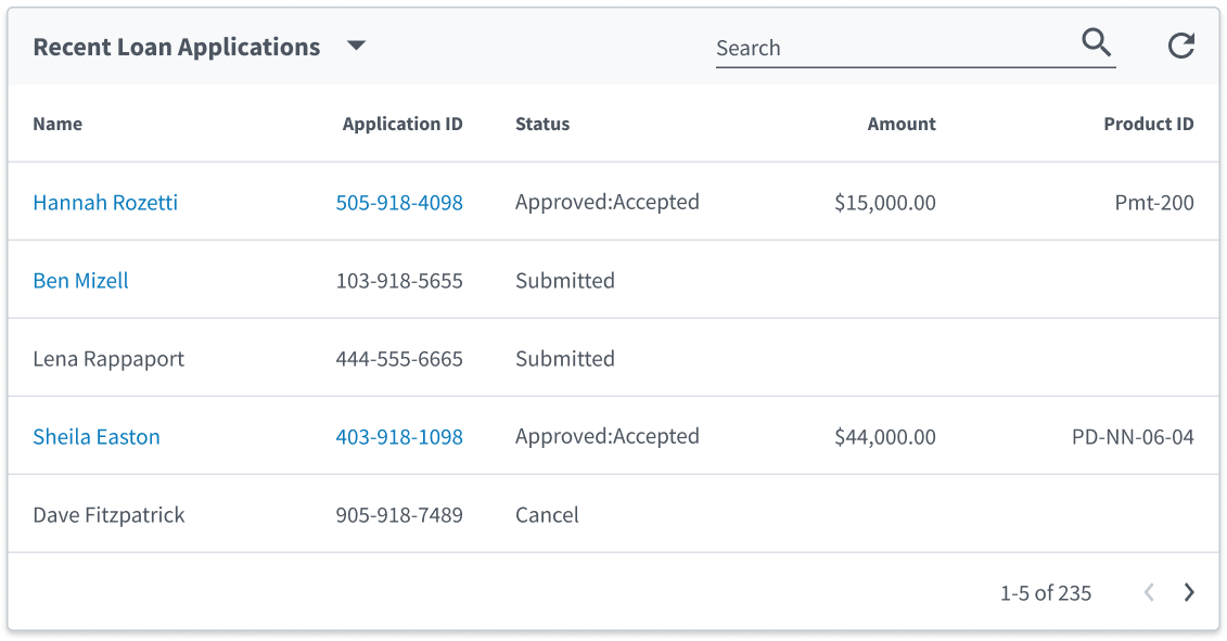
Initial designs did little to improve on system-provided Application Statuses due to a rush to get to market, where there were higher competing priorities. We simply surfaced the statuses available to use in the database
Updated Experience
After the redesign, users had easily understood application statuses with clickable tooltip explainers, enabling sales reps to work their pipeline in a more targeted manner and send charge requests where necessary.
Merchant Portal All Consumers View
Problem
The previous feature was a success but there was more work to do, in that merchants expressed a desire for a larger view of all their consumers with details beyond application statuses. The problem was that their customer view was still too narrow.
Design Solution
Expand on the previous feature with an interactive data table that has customizable columns, clickable actions in various cells, and robust filtering and sorting across columns.
Outcome
At the time this feature went to production, approved applications were hovering at 73% and within a month we saw this climb to 81% as merchants were able to better manage their customer base. The export function on this table also enabled larger remodelers to integrate their data with external CRMs which increased merchant satisfaction.

We designed a flexible consumers table to support contracting companies of all sizes. Users can transact with consumers, copy data, view application statuses and loan details, filter by approval date or sales rep, customize columns, export data, and adjust row counts. Fullscreen mode was critical to support up to 11 visible columns without crowding the UI.
• View Figma Prototype
Merchant Portal Payment Calculator
Problem
Many lenders offer a payment calculator so consumers can shop rates without actually applying, and our merchants requested this as a "table stakes" feature. Due to the competitive nature of loan products, the business wanted to protect our lending rates behind a login inside the merchant portal.
Design Solution
We designed a Payment Calculator tool that lives inside the merchant portal where a user can calculate all loan offers on their company rate sheet at a desired spend amount.
Outcome
This resulted in a 14% increase in loan applications overall, and a modest 7% bump in approvals. Due to the credit policies of our lenders, overall approval rate amongst consumers is somewhat out of our control. However, as the platform improved in sophistication with features like this, it became easier to get more lenders on the platform, which lifted approval rates.
Because 26% of merchant portal users accessed the product from a mobile device, it was critical to make payment calculator work on mobile. This ensured a seamless experience for all users, regardless of the device they were using, and allowed sales reps in the field to quickly show consumers monthly payments at different spend amounts.
This flow depicts a sales rep using the payment calculator to determine the monthly payment across all loan products at a spend amount $20,000, then recalculating across all products at a lower spend amount of $15,000. This use case was central to the success of the feature, helping consumers lock in the monthly payment they desire.
Merchant Staged Funding
Problem
We needed a risk mitigation mechanism to stop fraudulent merchants who attempt to draw the entire loan balance before completing the project.
Design Solution
We designed a feature called Staged Funding that is highly configurable based on the relative risk of the merchant and project. It releases funds in phases as a percentage of the whole loan balance with the option to insert a waiting period between charges.
Outcome
This feature reduced merchant–consumer disputes by 21% and lowered delinquent consumer accounts by 12%. While it meaningfully reduced platform risk, its deterrent effect on potential fraudsters is difficult to quantify without long-term data.
This flow demonstrates one configuration of the Staged Funding feature, where the merchant can draw 50% of funds to start the project and 50% at completion. A short waiting period prevents the merchant from drawing 100% within one week. This configuration was ideal for HVAC companies that have a relatively high ticket price and get the install done in 7 days or less.
• View Figma Prototype
Merchant Portal Custom Branding
Problem
The business identified an opportunity for large partnerships that required a feature we currently didn't have - the ability for an entity to brand the merchant portal.
Design Solution
We designed a feature called Custom Portal Branding that allows entities to brand the merchant portal with their own logo and colors. This made the financing experience feel more seamless to the consumer.
Outcome
By using a color palette predominantly made of grayscale colors, applying a small amount of custom colors and a logo made the portal feel quite customized. This simple feature nearly doubled our merchant base by enabled our sales team to tap into pre-existing contractor networks. It now drives about 40% of revenue.
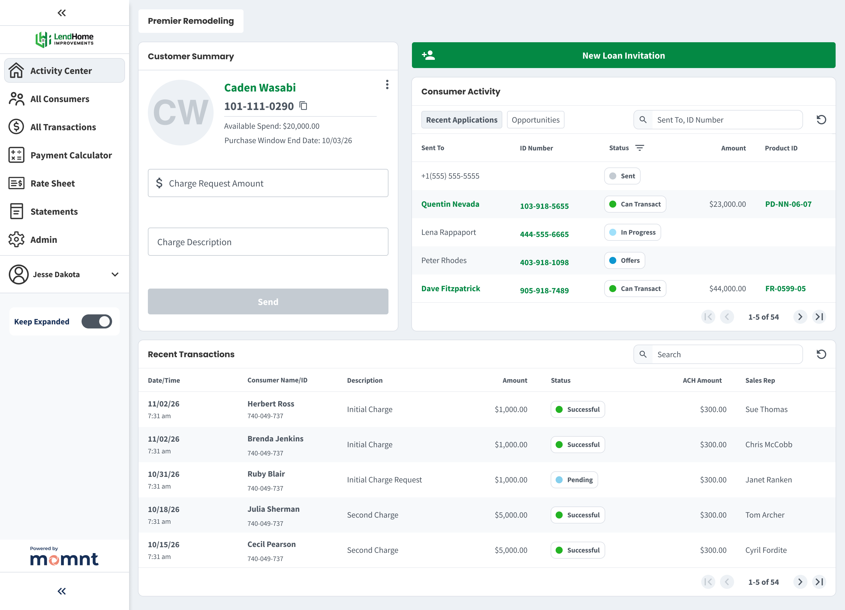
Lend Home Improvements is a platform that markets and offers home improvement financing solutions to a large network of contractors. They decided to partner with Momnt offering a branded portal to their customers. It was extremetly advantageous for Momnt to lock in this "one-to-many" relationship with an existing network of contractors. This network alone increased our merchant base by 36%.
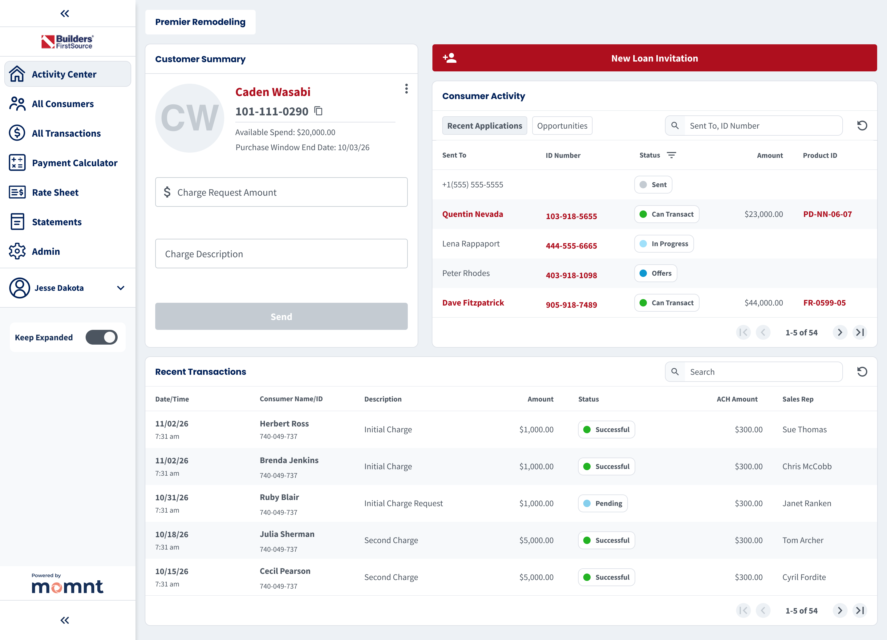
Builders FirstSource, Inc. is a Fortune 500 company that is a manufacturer and supplier of building materials. They also partnered with Momnt to offer a branded portal to their customers, enhancing their service offerings and streamlining the financing process for contractors. This is increased our merchant base by 12%.
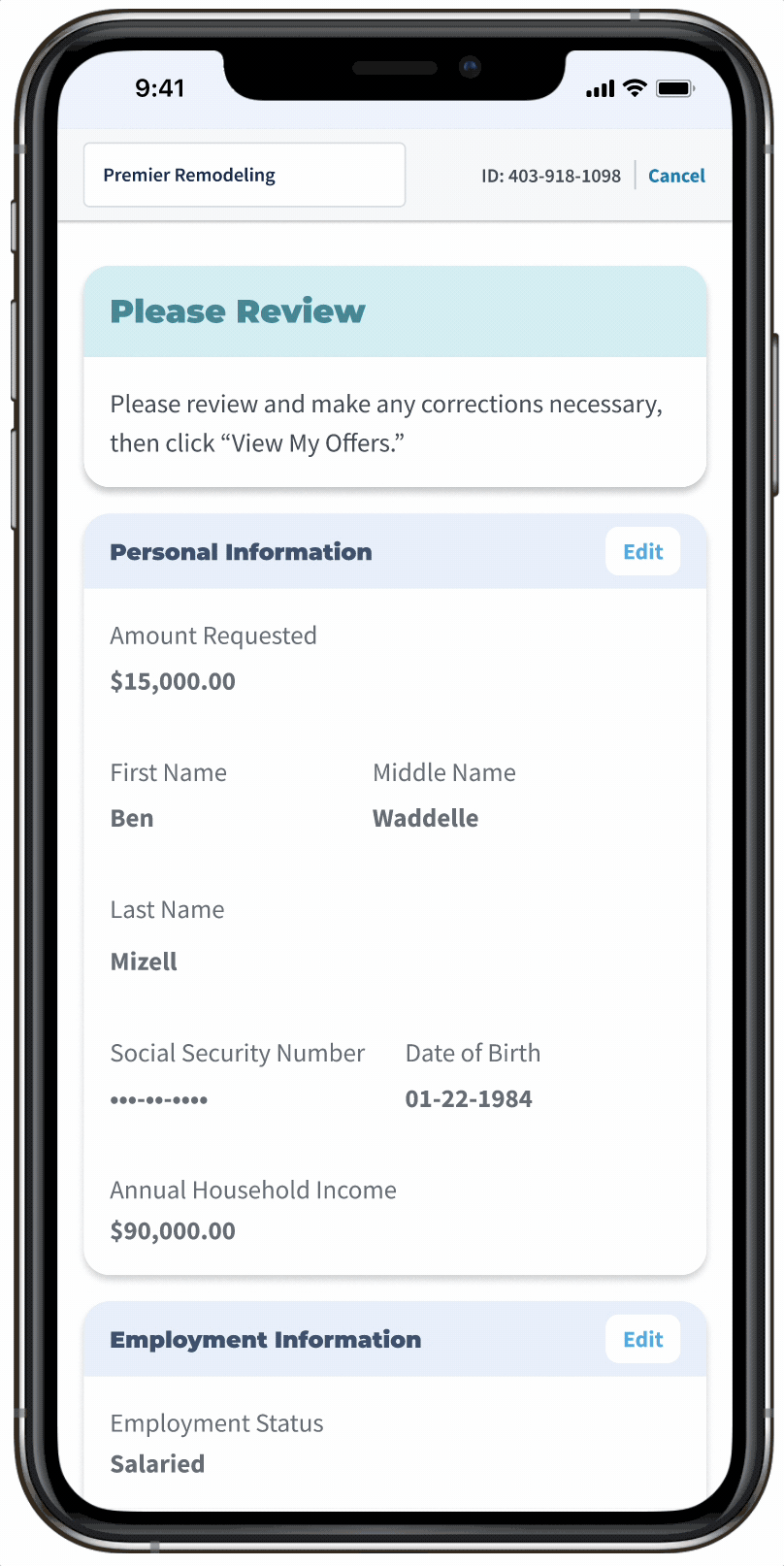
Merchant Onboarding
Problem
Underwriting a merchant for lending requires a lot of data capture and these flows are typically long and complex, leading to high abandonment rates. In a rush to get to market, the earliest version of this was a series of 4 to 5 very long forms with a completion rate hovering around 60%.
Design Solution
After testing multiple prototypes, we designed a step-by-step flow with clear progress indicators and the ability to save and resume at any point. Critical identity verification steps were placed early to deter fraud, reduce manual underwriting, and improve overall merchant quality on the platform.
Outcome
We reduced average time to completion from 17 minutes to 8 minutes and increased completion rate from 63% to 85%. We saw around 28% of merchant applicants wanted start the application on mobile, so ensuring a seamless experience across devices where the user could save the application for later was critical to our success.
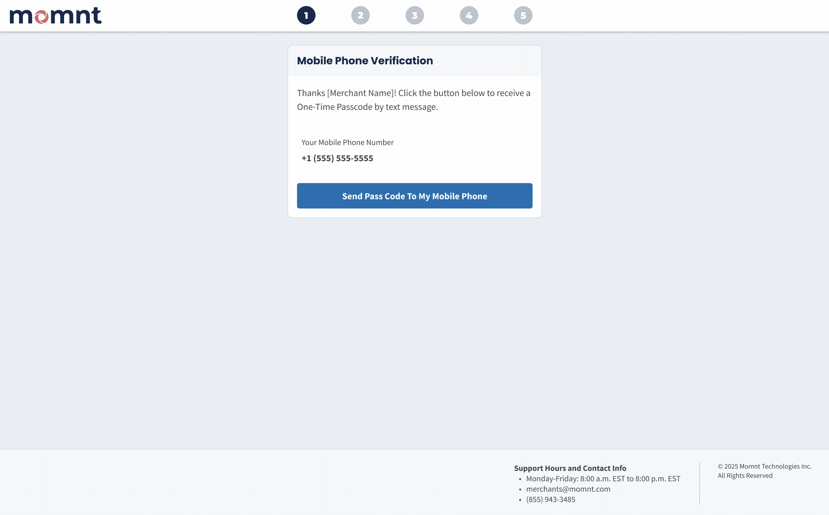
This is a portion of merchant onboarding from the One-Time Passcode step through getting the first look at our merchant portal. Keeping fraudulent merchants off our platform was critical, so putting a rather lengthy owners verification process early in the flow weeded out potential fraudsters who didn't have stolen business owner identities to use.
• View Figma Prototype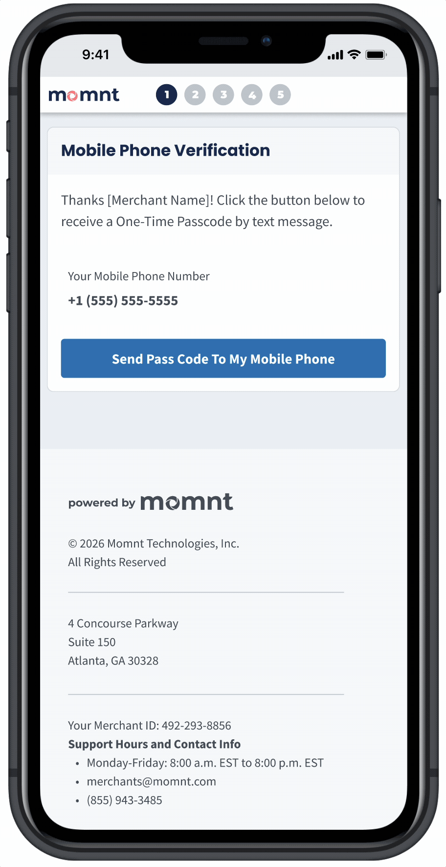
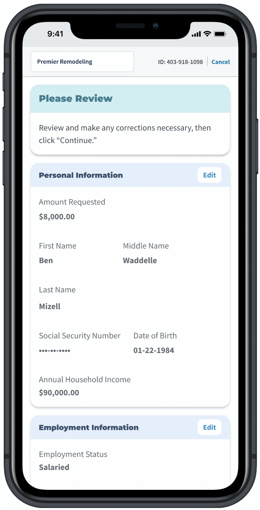
Because the desktop version of merchant onboarding utilized small centered cards, designing the feature for mobile was relatively easy, where the "Save for Later" button collapses to a kebab button. Long forms can be frustrating on smaller devices, but we saw onboarding completion tick up on mobile devices by a small percentage after ensuring the whole flow could easily be completed on a mobile device. Around 20% of users appeared to start one device type, save, and finish on another.
• View Figma Prototype
Consumer Onboarding - Loan Offers Design
Evolution
Problem
Early versions of loan offer designs focused on a "Legal Description" - a string of text our compliance team advised was essential. The business wanted this MVP in production as quickly as possible to unlock a funding round, and we quickly got feedback that we need something more visually appealing that made it easier to scan across loans and compare payments.
Design Solution
Our second major iteration introduced a more appealing design that enabled quicker payment comparisons, but it was still cognitively heavy, largely due to our compliance partners asking us to show a lot of information. The third iteration, informed by customer feedback and Lyssna testing, prioritized fast loan product comparison with optional drill-downs for details. This iteration also added the ability to select a maximum credit limit and lock in a desired monthly payment—a feature requested by over 70% of surveyed merchants.
Outcome
While loan acceptance rates ticked up 8% we also saw avergage loan size decrease by 6%. The business felt this was a win because it meant more customers were getting approved and accepting loans, even if the average size was a bit smaller. Approval rates are critical with merchants because they drive repeat usage - if a merchant's customers gets declined often, they are less likely to come back to the platform.
Version 1 - In the interest of getting to market quickly, the earliest loan offer designs utilized what is referred to as "Legal Description" in the loan offer database schema. Legal Description displays all information legally required for a consumer to make a decision on a loan, in a short paragraph format.
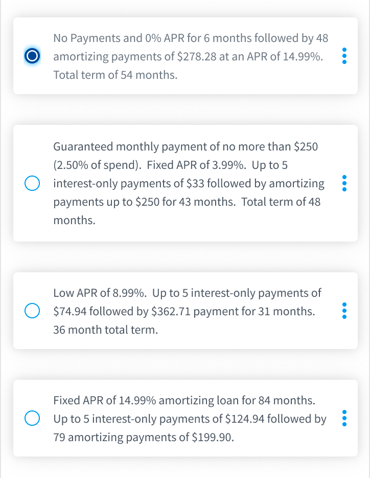
Version 2 - Because our loans included a “Purchase Window” with reduced payments, we presented offers with a headline, short summary, and two payment terms. About 80% of consumers qualified for a higher credit limit, so we let them compare payments for both their requested amount and the higher limit.
Version 3 - Research showed customers found our loan products confusing, especially when approved for more than they requested. We clarified that the final loan amount equals what they spend and gave users control to adjust their credit limit to see updated payments. We also simplified offers by highlighting key attributes: Low Payment, Low APR, or Deferred (little or no payments for [X] months).
• View Figma Prototype
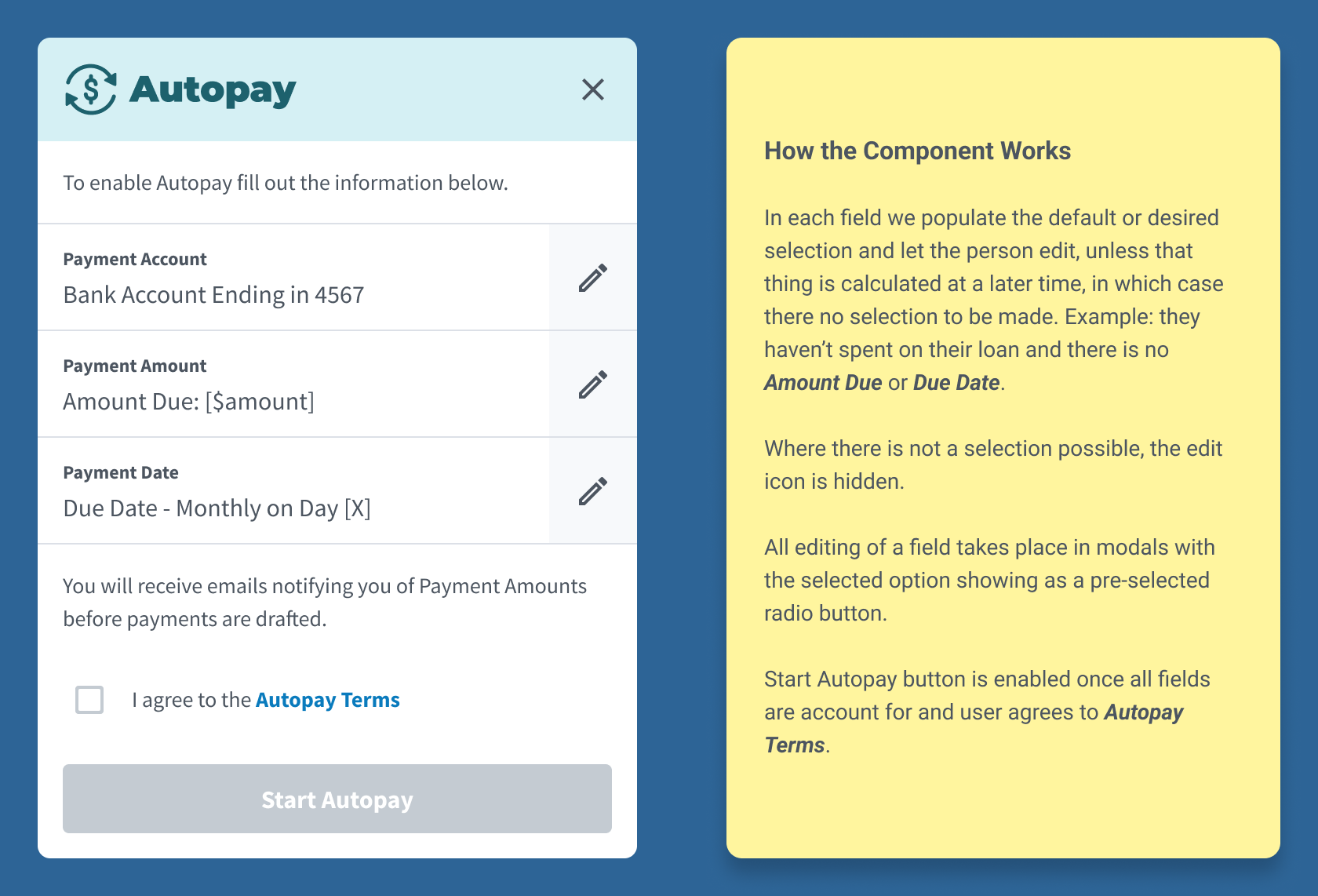
Consumer Onboarding - Autopay
Problem
Because Momnt’s revenue depends on loan performance, maximizing loan value was a priority. We needed to build an Autopay feature that encourages consistent, on-time repayment across both Fixed APR and Deferred Payment loan products. The difference between the two loans can be confusing for borrowers.
Design Solution
We designed a dynamic Autopay experience that enableds different features based on what type of loan you have, offering ultimately flexibility to the user in how they want to pay back the loan, but always communicating the consequences of late payments.
Outcome
This feature reduced delinquent accounts by 18% and increased the percetange of Deferred Loan consumers who pay off their loan in promotion from 85% to 96%.
Example of design handoff to engineers so they could learn the purpose and function of the component, and provide us any feedback before proceeding.
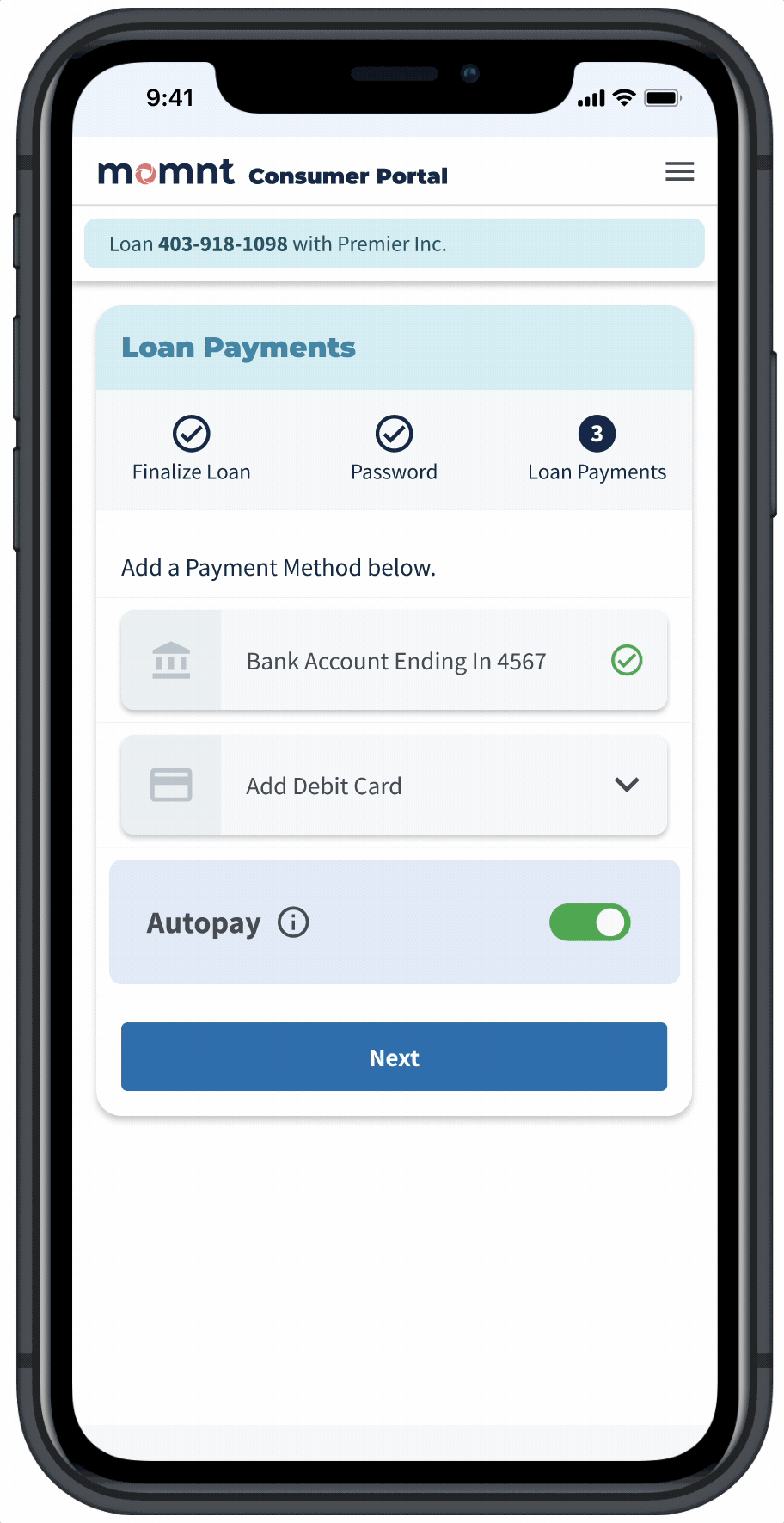
Consumers first encounter the Autopay component at the end of the loan application, where they are logged into the Consumer Portal and Autopay is defaulted to "On."" Demonstrated here is a consumer with a Deferred Payment loan. They are encouraged to leave Autopay set to "Pay Off In Promotion" where the system calculates payments to ensure they pay off the loan before the promo window ends.
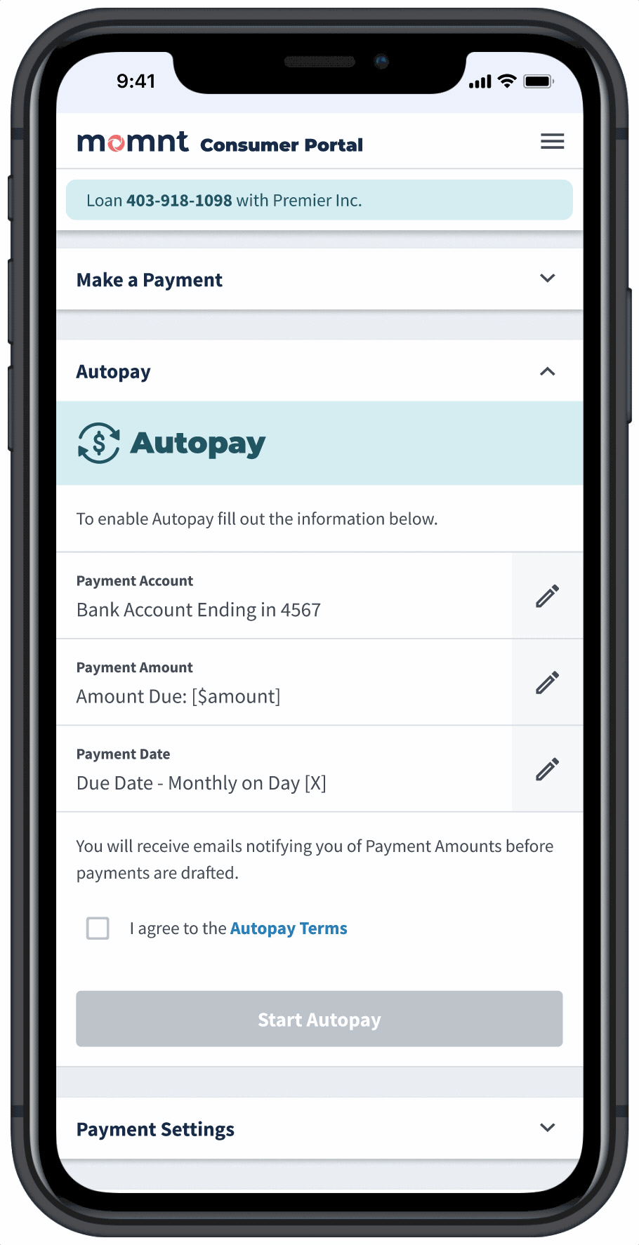
If a user disables Autopay during onboarding, they can easily re-enable it later in the Consumer Portal using the same component. Demonstrated here is what many users do: pay more than the minimum to avoid interest. We built several guardrails for “unhappy paths.” When a selected Payment Date or Payment Amount could trigger late fees, the system warns them. To summarize, we designed the flow to guide all users toward consistent, on-time payments.
Enterprise Portal - Internal Tool for Loan Servicing and Merchant Management
Building a tool for managing consumer accounts and merchant accounts was a critical objective after launching the MVP. The Enterprise Portal (EP) allowed customer service reps to view and manage consumer loans, process payments, and handle customer inquiries. It also provided tools for underwriting and managing merchant accounts. I designed the EP with a focus on usability and efficiency, ensuring that reps could quickly access the information they needed to assist customers effectively.
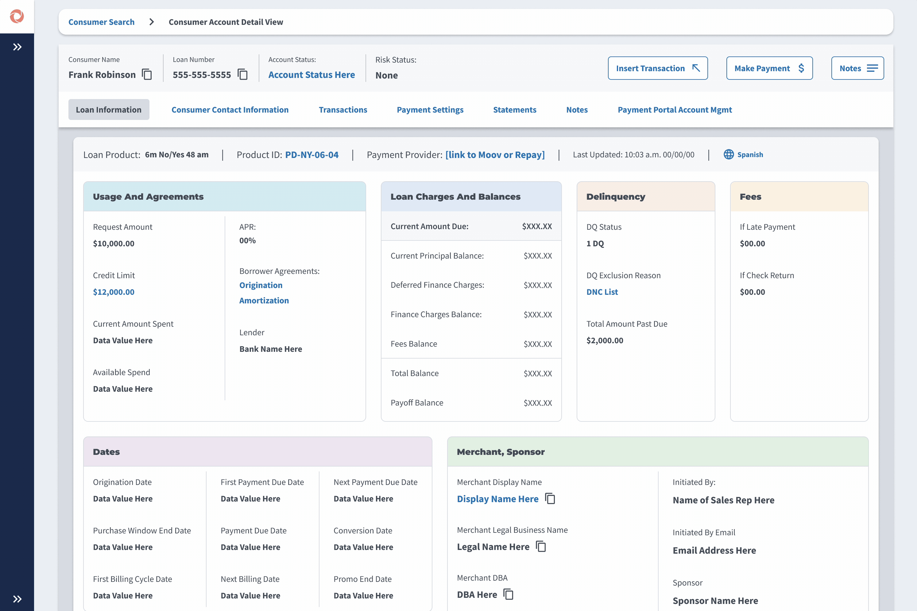
Here a Momnt employeee uses Consumer Account view, where they can take payments and answer inquiries about the loan. As mentioned before, Autopay was a critical company-wide initiative so we designed a way for Momnt reps to turn on Autopay on behalf of a customer while grabbing a legal consent over the phone.
Here a Momnt employee is looking at a Merchant Account in Enterprise Portal. They apply a Risk Tier, which applies the default corresponding Staged Funding configuration for that Risk Tier. They then customize the Staged Funding configuration for this specific merchant, enabling a shorter wait time between the first and second draw.
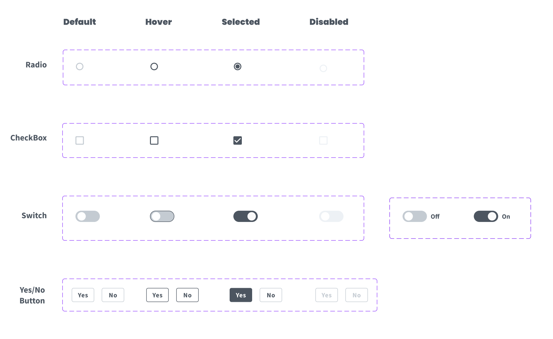
Design System - Inputs and Alerts
Establishing a Design System with strong documentation is critical to ensure consistency and efficiency. Early on I created "Common UI," our library to house everything from inputs to more complex table components. 6 years later this library covered a broad array of design guidelines and components: breakpoints, buttons, modals, cards, forms, inputs, alerts, tables, charts, and various forms of progressive displayers.
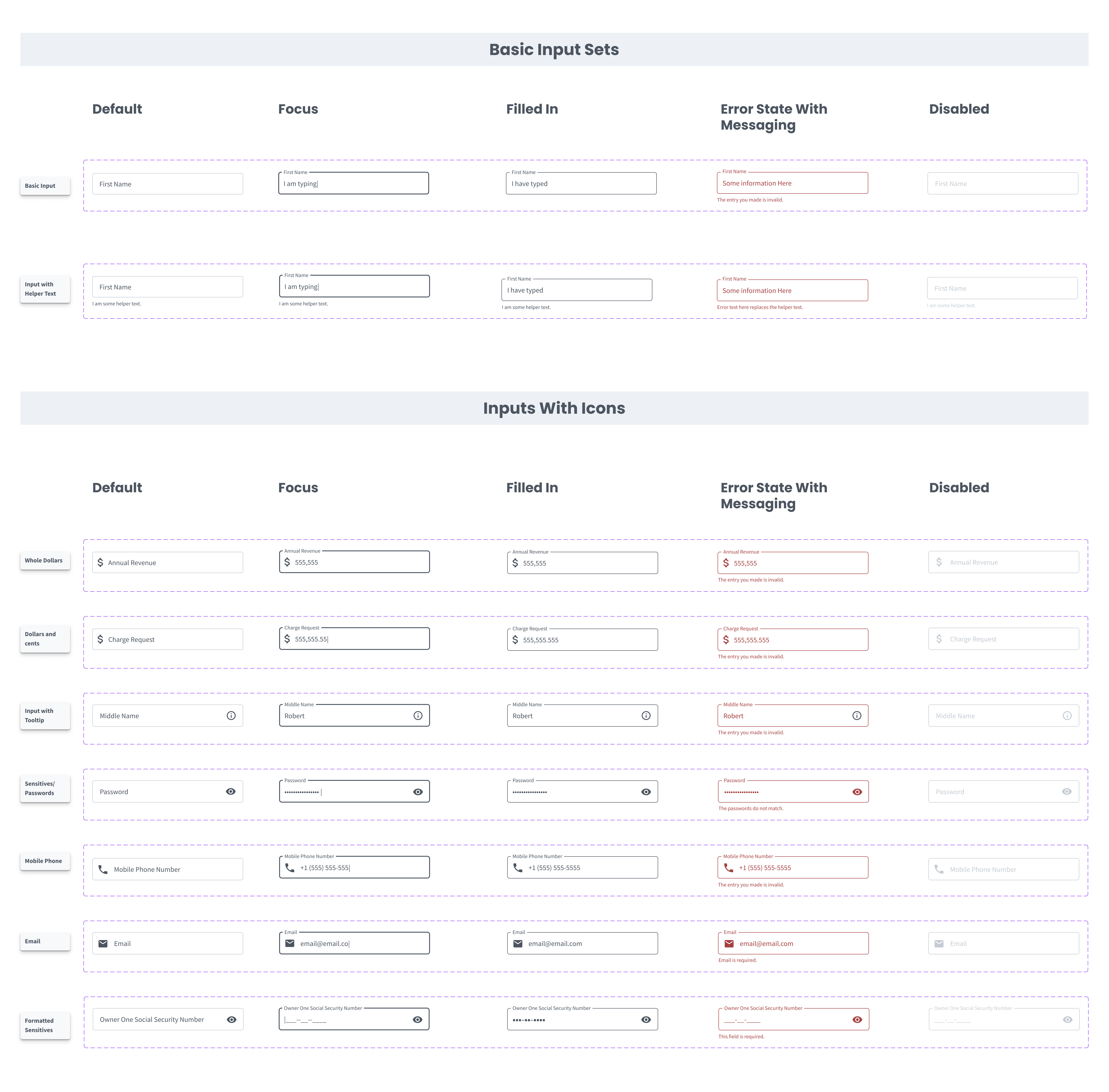
Example of our documention on input types and states.
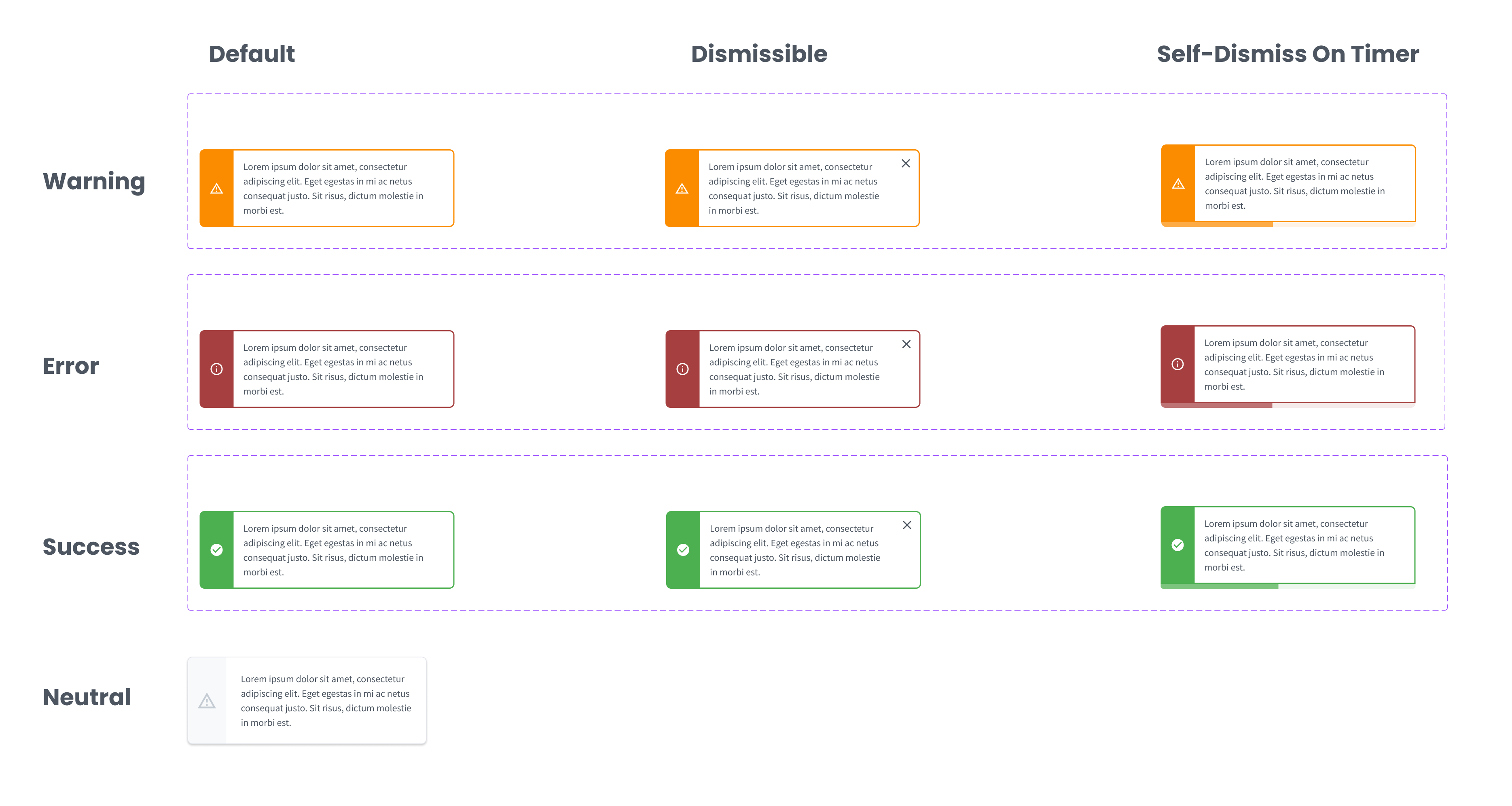
Our alerts could be embedded with the page or in a modal layer. Each type: warning, error, and success had three states: default or persisting, dismissible, and self-dismissing.
Design System - Buttons and Selectors
We developed a simple yet useful array of button styles across customer-facing design and internal tool design (Enterprise Portal). We kept color patterns pretty simple due to branding concerns because buttons are one of the places dynamic colors are applied for large partners who want to customizse the portal.
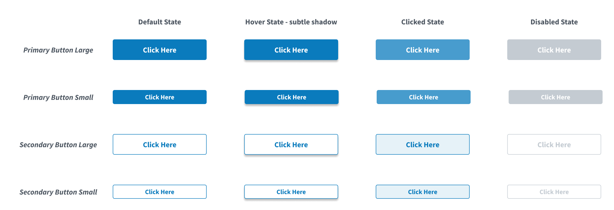
Our base button styles and related states.
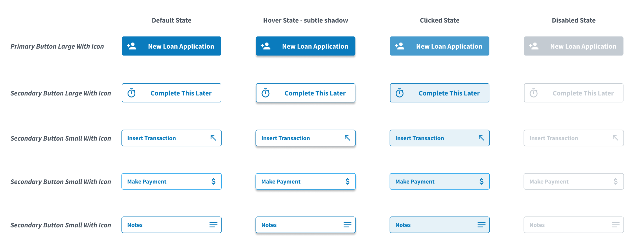
Buttons with Icons and their related states.
Example documentation on various selectors and their states.
Design System - Progressive Displayers
We tried a few different patterns for progressively displaying information, partcularly in the consumer experience side of things where educating borrowers on loan terms was critical.
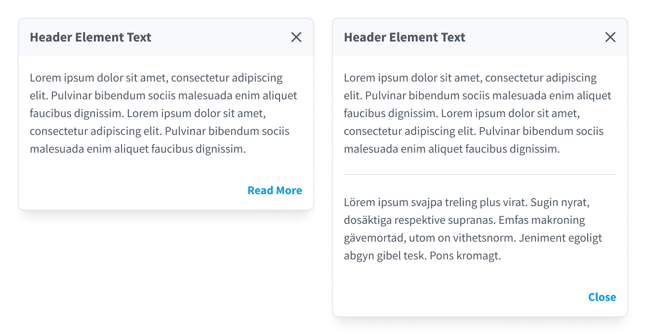
A "Read More" modal for instances where we provide introductory details and then an opportunity to dig deeper.
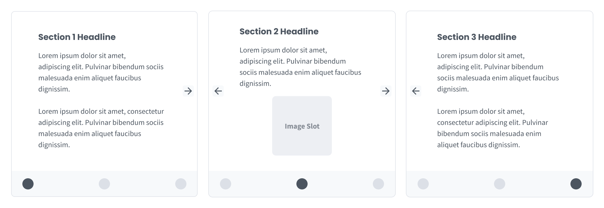
A three section slider displayer we experimented with for teaching people how loans work.
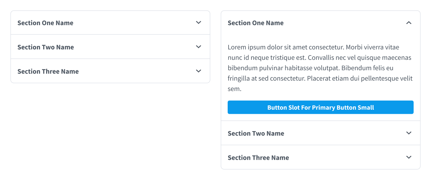
Our basic accordion with an added button slot in expanded view.
Design System - Table Component and Related Column Filter Mechanisms
Data tables are fairly ubiquitious in product design but not always done well. We strove for really clear table design that has room to breathe, where the user is in control and can manipulate the table to their desired view.
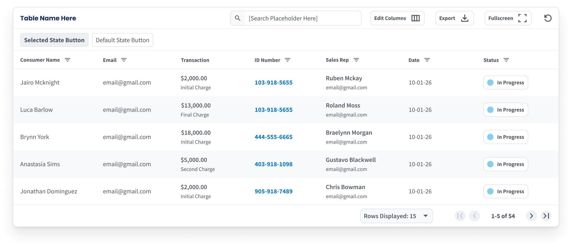
Our Data Table component with all functions turned on.
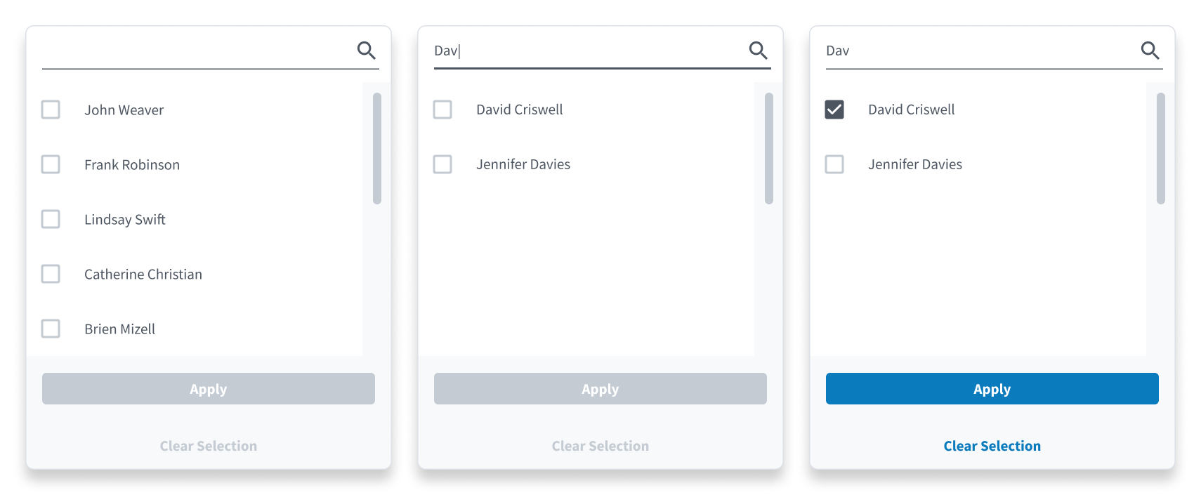
Filter with Search - a mechanism for filtering by the values in a column where there are a lot of possible values. As a result, you need able to search and scroll for the item you need.
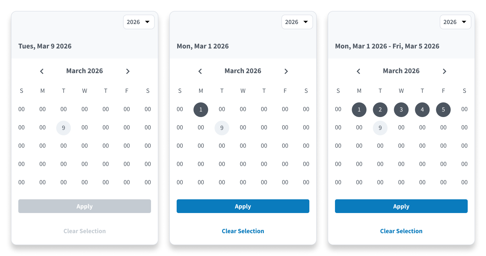
Our Date Range Picker for isolating spans for time.
 and
and
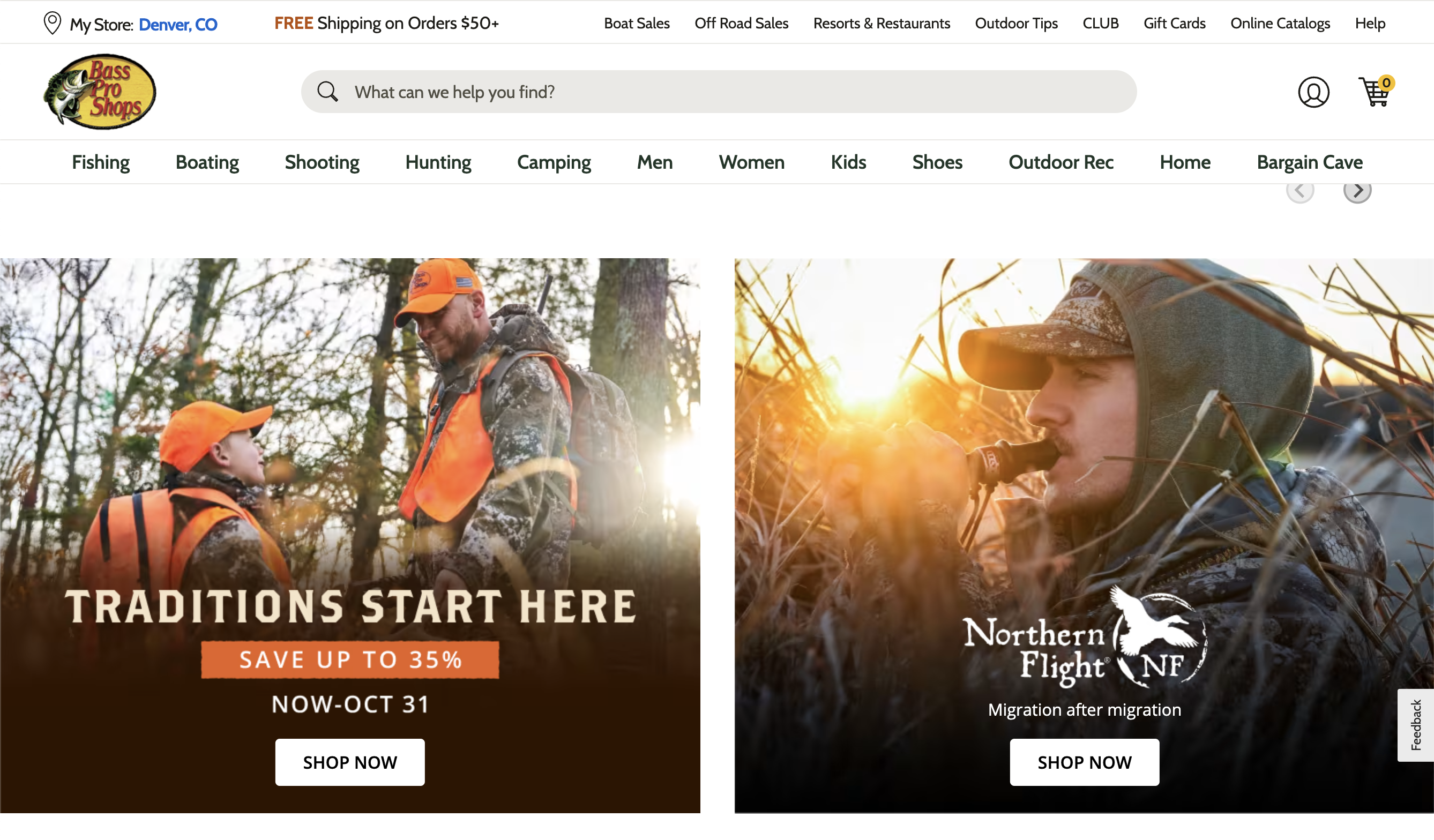
What is Bass Pro Shops?
Bass Pro Shops is America's premier outdoor and marine equipment retailer, with over 180 stores across the US and Canada. When Cabela's was acquired by Bass Pro Shops, they simplifed their e-commerce platform by having one database for inventory management, and two "front ends" basspro.com and cabelas.com. During the pandemic, outdoor activities surged while supply chains strained, creating unique UX challenges.
My Role:Senior Product Designer
Bass Pro Shops and Cabela's hired me to work on several different products, and mentor junior designers. What follows are a few examples of features I designed across six products:
- BassProShops.com
- Cabelas.com
- Bass Pro Shops iOS App
- Bass Pro Shops Android App
- Cabela's iOS App
- Cabela's Android App
Accomplishments at Bass Pro Shops and Cabela's
-
Create Account Flow for iOS and
Android
- Increased Create Account Flow completion from 24% to 46% in iOS and 20% to 32% on Android over the course of two months from deployment.
- Established new global input style that was much easier to read and use due to clear labels and focus states.
- Ensemble Purchasing
- Designed a feature modeled after Home Depot's "Frequently Bought Together" feature.
- The feature reached ~50% of shoppers at add-to-cart, with 9% of those users purchasing the full package, representing a meaningful sales lift at scale.
- COVID-19 and Inventory Management
- Improve filtering by how a product can be obtained in product list pages.
- Used testing to validate whether users want to see out of stock items.
- Importing Browser Ads into Mobile Apps
- Improved "text on photo" style adds by creating a card design to hold the content.
- Established a percentage width sizing constraint for cropping landscape oriented images.
Create Account Flow for iOS and
Android
Problem
In the Mobile Apps (iOS and Android) only 24% of users that started a create account flow finished it, and the team wanted to increase the completion rate. It goes without saying, a lot of valuable customer data comes from account creation flows that can be utilized for marketing purposes.
Design Solution
When I reviewed the current state, some basic UX best practices were being ignored such as clear labels, focus states, and error messaging. Additionally, the inputs almost looked disabled, and users generally do not like long vertical stack forms. So we broke out the steps to give the user a sense of progress being made, with clearly labeled inputs with focus states and improved spacing.
Outcome
We saw create account flow completion rise from 24% to 46% in iOS and 20% to 32% on Android over the course of two months from deployment.
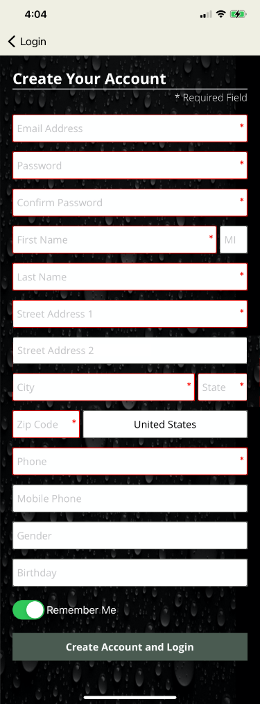
Before
The previous create account flow made the form feel overwhelming and confusing for users. While there is precedent for having label as a placeholder inside the input, this text style looked disabled and it didn't pass contrast testing for the visually impaired
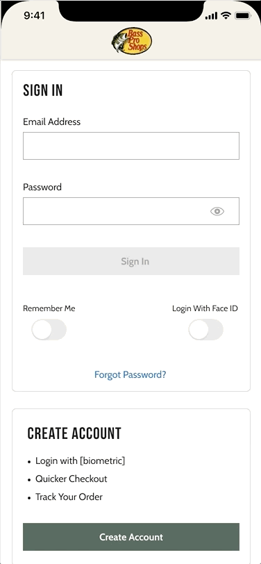
After
Breaking out the create account flow into multiple steps with clear input labels and input requirements makes the form feel easy to complete. As a result, the completion rate for create account flows increased 24% to 46%.
Ensemble Purchasing
Problem
On the websites, I was asked to design a feature modeled after Home Depot's "Frequently Bought Together" where the parent item on a product display page can be added to the cart with two or more related items with one click. In the Home Depot example to the right, some grout is paired with two items normally used in a tile install project.
Design Solution
Bass Pro uses a vendor called Certona for purchase history data collection. Their product supports features like "Frequently Bought Together" and other ensemble purchase concepts. I worked closely with Certona and the product manager assigned to this feature, to map out a phase 1 and 2 for our version of "Frequently Bought Together." My design introduced phase 1 of "Frequently Bought Together" where only single SKU items are eligible for the feature.
Outcome
Ensemble Purchases initially underperformed because the display threshold was too low, surfacing combinations with limited purchase history. After raising the threshold to show only ensembles purchased at least 10 times, adoption improved significantly. The feature reached ~50% of shoppers at add-to-cart, with 9% of those users purchasing the full package, representing a meaningful sales lift at scale.
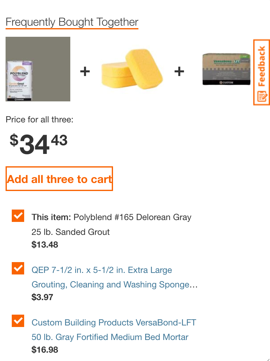
We modeled our Frequently Bought Together feature off Home Depot's implementation, where ensemble purchases are a natural fit for home improvement projects. Judging from our research, Home Depot's bundle purchasing mechanism was quite accurate and rarely presented an item that seemed out of place.
Early testing suggested that wrapping the items in a card helped the user understand how the items were related. We capped the "FBT" items at 3 to avoid overwhelming users, and made it easy to remove items from the bundle where unchecking an item also displayed the text in a secondary or "disabled" color. The goal here was the make the user feel in control despite the system making bundle recommendations.
COVID-19 and Inventory Management
Problem
During COVID, outdoor equipment demand soared while supply chains struggled. Customers frequently ordered items that were out of stock, leading to frustration and cancellations. Product List Pages needed much better filtering capabilities.
Design Solution
We conducted a small user study to get feedback on proposed solutions: the ability to hide out of stock or in-store only items. 74% of customers tested said that would satisfy the need, but they additionally proposed that each item be labeled with availability statuses so that you knew how you could acquire the item before adding it to cart. We moved forward with the proposed designs and added the acquisition options to each item card.
Outcome
Call volume regarding inventory complaints decreased by 21% after implementing the new filtering and labeling features, and store managers reported there was less confusion about what items were "pick up in store" vs "ship to home".
Positioning the availability filters at the top left was key to satisying customer complaints about out of stock items. These designs tested well and participant sentiment was that they felt in control of what they were seeing.
Detail of a product card where acquisition options were clearly labeled.
Importing Browser Ads Into Mobile Apps
Bass Pro Shops runs on an e-commerce platform called WCS, which powers everthing from banner ads to product display pages. In the apps, I was asked to design a way to display large banner ads from WCS, that were often text on top of a photo.
Example of "Text on Photo" ads that needed to be imported to Mobile Apps. These ads were not designed by me, are difficult to read at smaller sizes, and my job was to improve their readability on mobile.

Card style for importing ads that improves readability and has a clear CTA.
Enterprise Tools
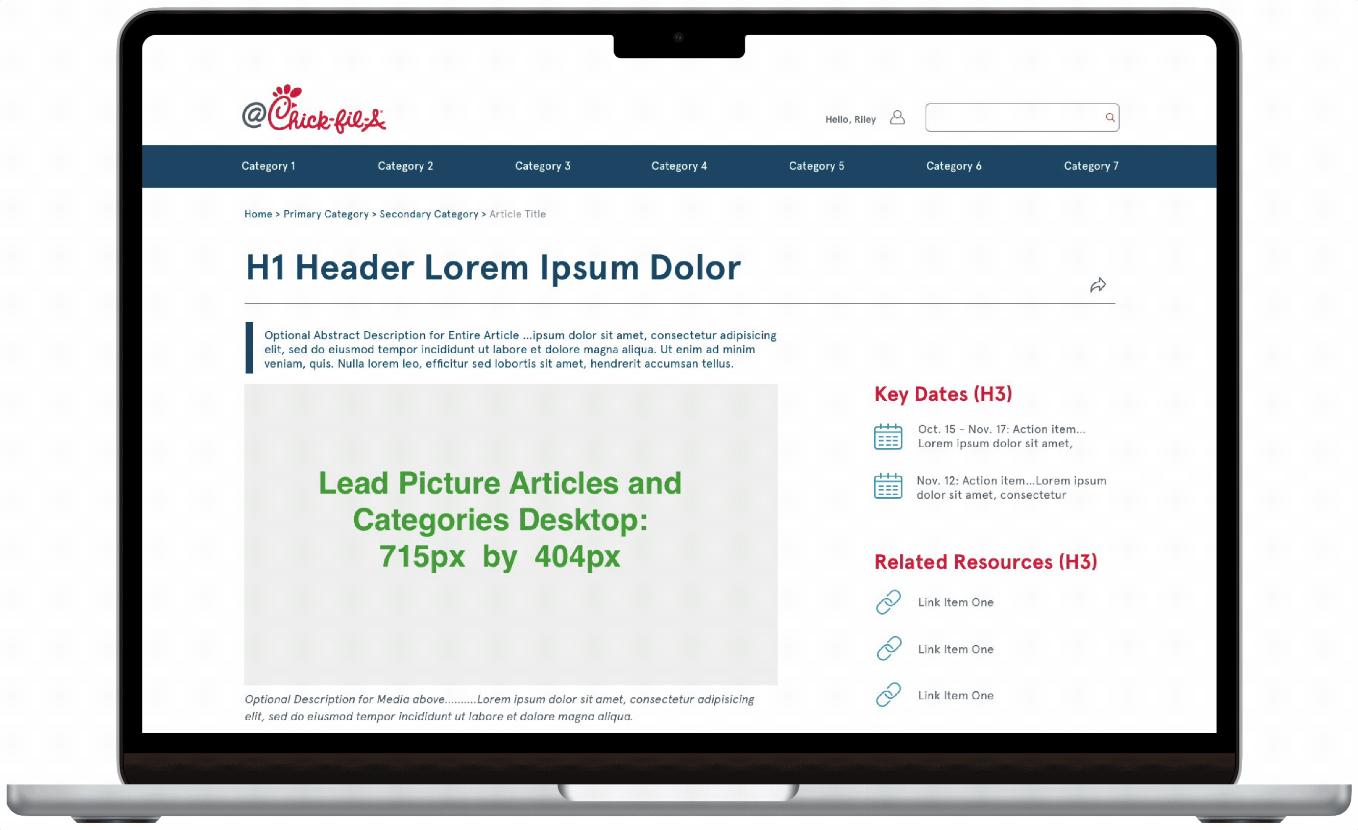
What is Chick-Fil-A?
Chick-fil-A is a fast-food chain specializing in chicken products with over 3,000 locations across the United States, Canada, and Puerto Rico. As of October 2025, there are 3,354 restaurants in the US alone. Restaurants are run by carefully selected franchisees who need access to great digital tools to run their locations.
My Role:As a UX/UI Design Manager at Sogeti, I was brought in to refocus and redesign Chick-fil-A’s intranet, @Chick-Fil-A, after several project restarts. My role was to streamline a long list of proposed features into a pilot-ready launch within six months, with room for future expansion. The intranet is the primary communication channel between corporate HQ and store operators, and I was struck by Chick-fil-A’s commitment to investing heavily in an internal tool—something many companies overlook in favor of customer-facing apps.
Accomplishments at Chick-Fil-A
- @Chick-Fil-A Page Templates
- Content Articles - a template for editorial, training and supply chain content with mid page navigation module to fast forward to desired topic.
- Store Owner Metrics Template
- Operator Control Panel
- Designed tiles for store metric feeds, recent content, contacts, recent vendors, training progress.
- Landed on the desired sequence of tiles in final "Operator Control Panel" prototype.
- Notifications and Recall Alerts
- Delivered scrollable notification prototypes for Store Owner level communications.
- Deliver Alert modules for critical food recalls.
- Expanded Icon Library
- Drafted approximately thirty icons to cover a broad list of needs ranging from contact icons, specific data icons, document types and celebratory icons.

Mockup of @Chic-Fil-A homepage news for store operators with hero section and control panel.
@Chick-fil-A Content Articles
@Chick-fil-a content articles are templated pages that need to support content ranging from corporate news to training and critical vendor information. By suggesting standardizing image ratios and using filler copy, stakeholders were less distracted by content and more focused on the architecture, which helped us streamline the review and approval process. I introduced a mid-page navigation system using “scroll-to” links so that users could quickly get the part of the article most critical to them.
Multi-topic Article Desktop
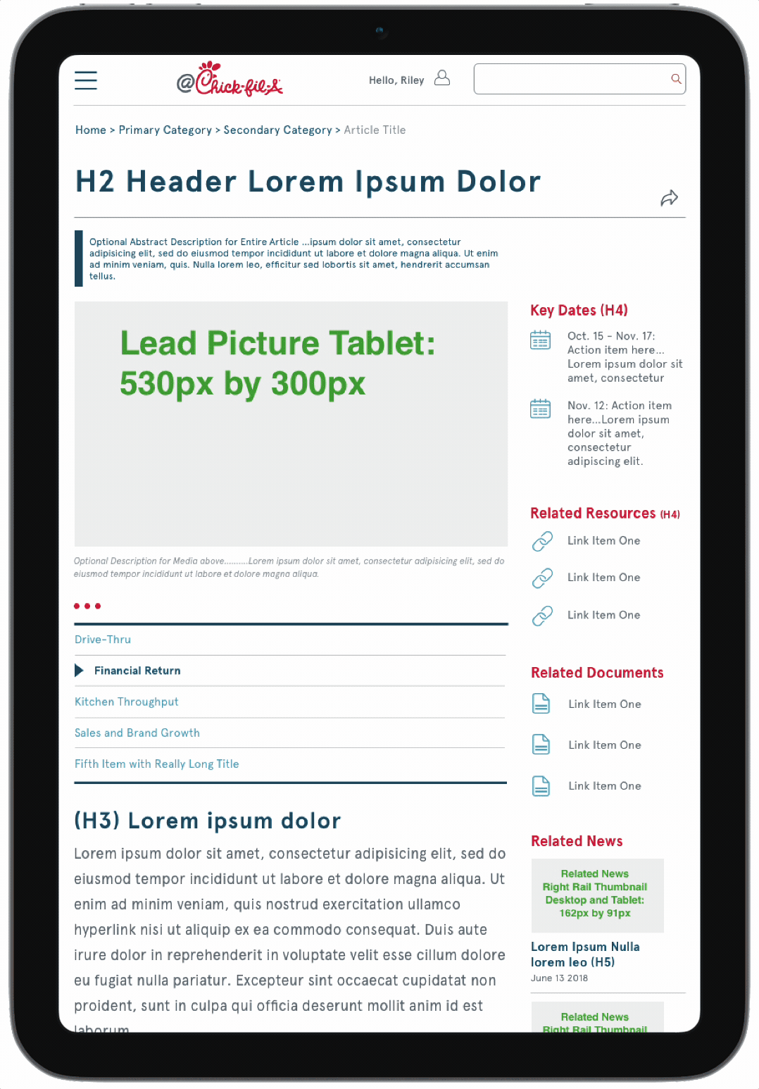
Multi-topic Article Tablet
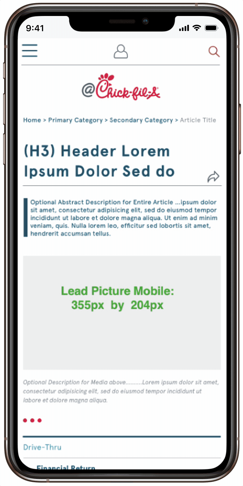
Multi-topic Article Mobile, with collapsible panels for the long list of resources in the footer element.
@Chick-fil-A Operator Control Panel
Stakeholders wanted to see a dashboard-style page element, that would be inserted just below the hero section on the default home page for all store owners, in order to give them an overview of critical information such as franchise opportunities and store training progress on critical issues. This started as a wireframe exercise to determine the right sequence of information tiles, and evolved into a high-fidelity prototype after stakeholders agreed on the content hierarchy.
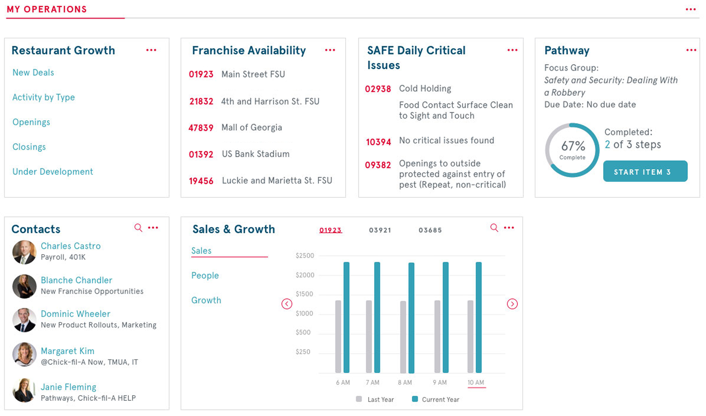
Operator Control Panel - this design element was to be inserted in the default home page for store operators, just below the hero section in order to provide an overview of growth opportunities and training progress.
Notifications and Recall Alerts
Among the top priorities for @Chick-Fil-a was to divide communications between critical and non-critical and deliver them differently. For non-critical notifications, I designed a notification module that could be scrolled through to see multiple notifications. For critical notifications, such as food recalls, I designed a forced notification module that would appear as an overlay on any @Chick-Fil-a screen until the user acknowledged the message.
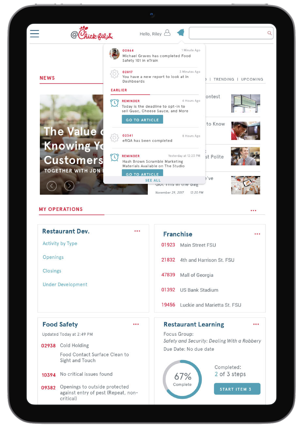
Scrollable non-critical notifications for store operators accessible by clicking the notification icon.
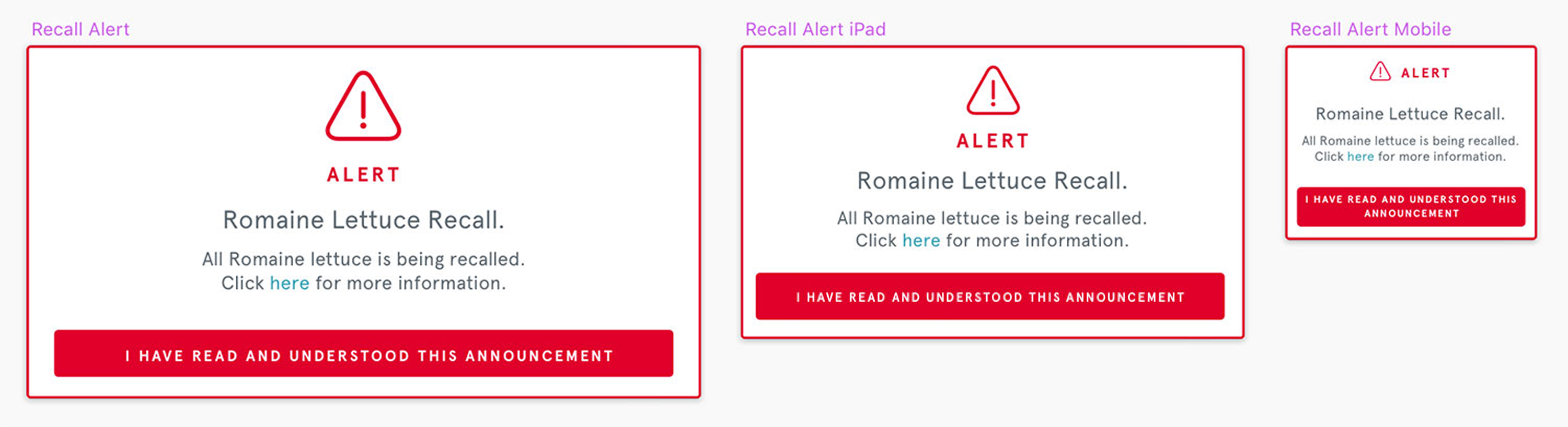
Forced notifications that store an acknowledgement for food recalls and urgent updates. These would show up on any @Chick-Fil-a screen as an overlay any time corporate HQ needed to push an emergency communication.
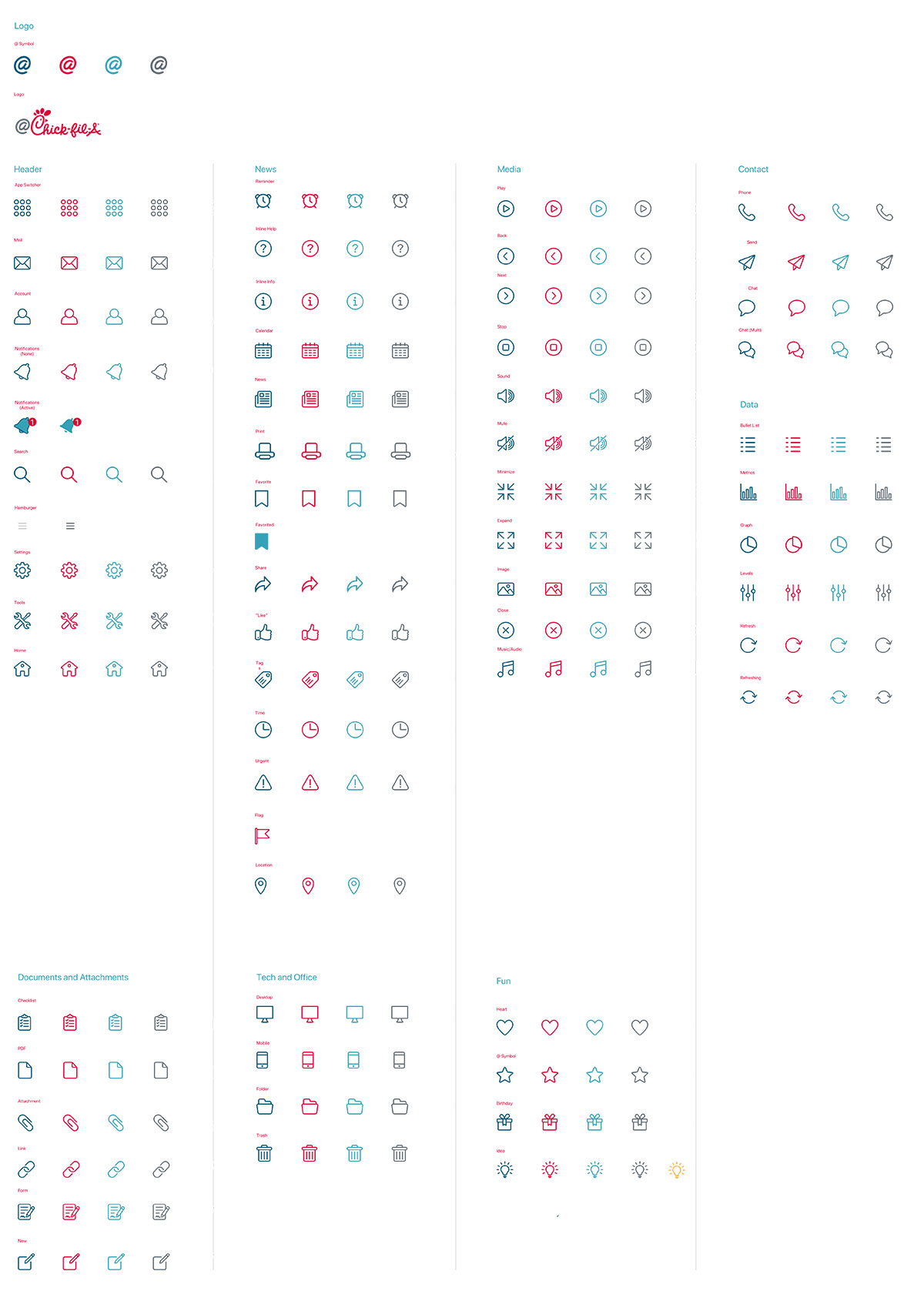
@Chick-fil-A Icon Library
As the project grew I gained access to a growing icon library that didn't fully meet our current needs. So I took what had already been drafted and drew another 10-15 icons to cover a broad list of needs ranging from Contact icons to Document and Attachment icons.
Part of the icon library I contributed to, demonstrating icons used across all web-based applications.
Finli - Family Financial Platform
What is Finli?
I worked directly with the founder of this family-centric fintech platform for gifting money within families. She had an ambitious vision with a long list of potential services, which led to my first real experience with tough feature-prioritization discussions. We set out to answer the question, "With only six months of budget and dev resources, which revenue-generating features should come first" With no existing assets, we started by building the brand from scratch: logo, typography, and a full design system.
My Role:Branding and Product Design, Feature Prioritization, MVP design and annotated handoff.
Accomplishments at Finli
- Branding and Color Scheme
- Logo and Colors
- App Colors and Components
- Feature Prioritization
- MoSCoW method (Must, Could, Should, Won't)
- MVP features identified: Messaging, Circles, and Balance & Transactions
- Straight to Hi-Fidelity Prototypes
- Sign in and Default View or Homepage
- Circles, Messaging, Balance & Transactions
- Annotated handoff
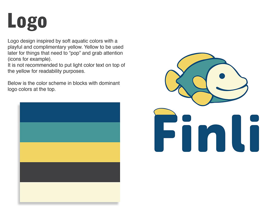
Finli is short for "Financial Literacy" and because this app aims to teach kids about money management, the founder liked the concept of having a mascot of sorts for the logo. We landed on a cool, calming color scheme with enough variety to be playful. All colors were tested to achieve desirable contrast ratios for accessibility.
App Colors and Components
Since we had zero visual assets, the Finli project started with creating a cohesive branding and color scheme that resonates with its target audience of children and parents. The design process involved extensive research into color psychology and testing for contrast.
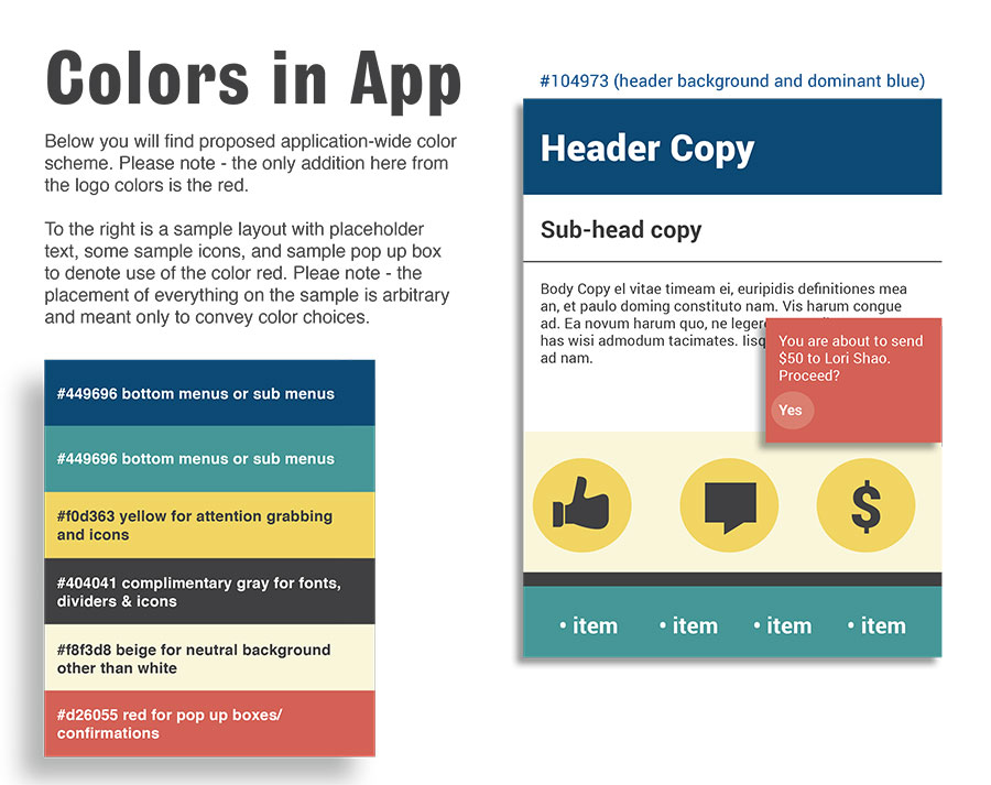
When branding work commenced, I already had a sense of where she was wanting to go despite the critical need for feature prioritization. I had enough information to start creating the color scheme and typography with an eye towards a playful yet engaging aesthetic.
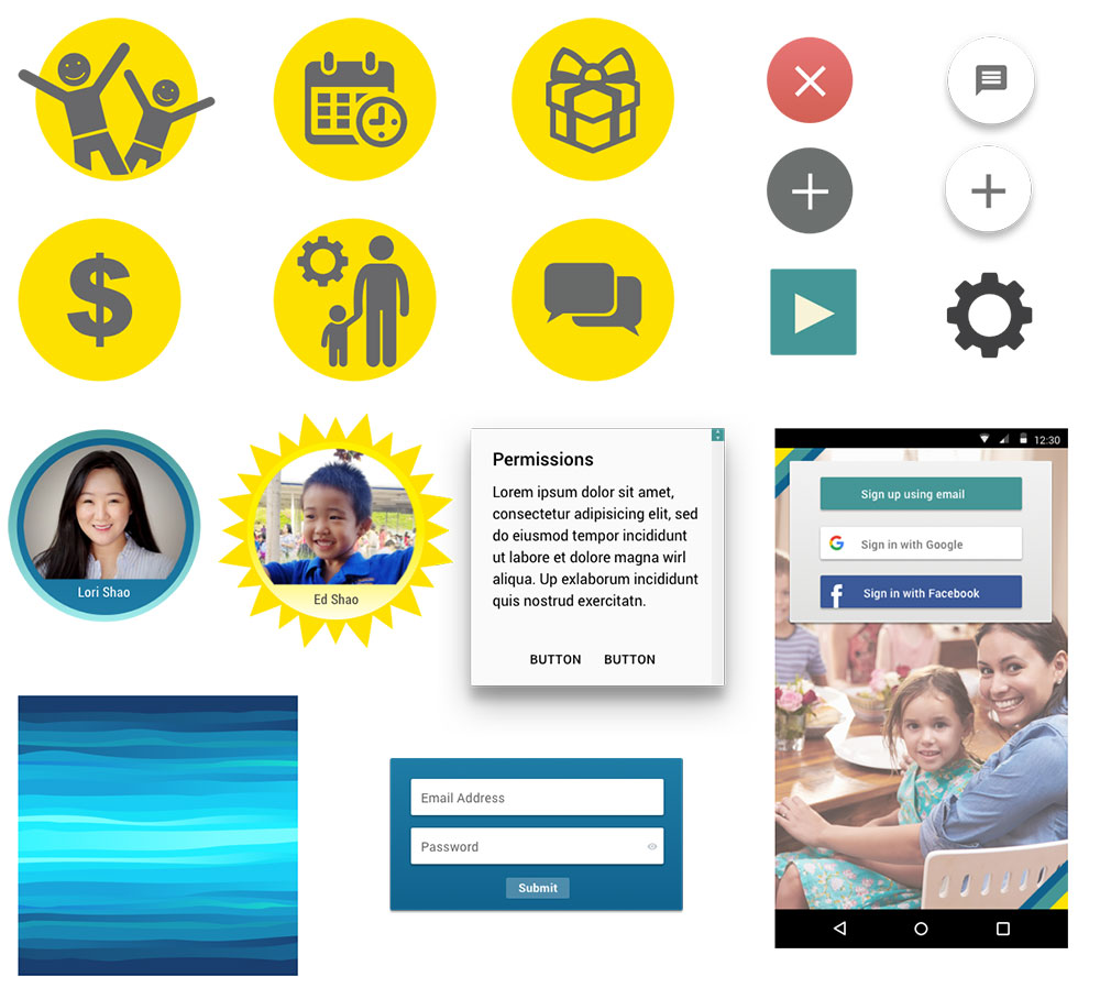
Towards the end of the branding/color scheme work, I explored the iconography and components we would need to support the three MPV features: Circles, Messaging, Balance & Transactions
Feature Prioriziation
The most challenging part of working with this founder was definitely feature prioritization. She had a massive and very enthusiastic vision for what this app could be, but very limited resources. So I patiently worked with her to identify the core features that would deliver the most value to users in the shortest amount of time. Using the MoSCoW method, we categorized features into Must-Have, Should-Have, Could-Have, and Won't-Have for the MVP.
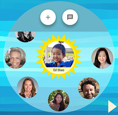
"Circle" - a designated group of go-to friends, family and neighbors that can gift money to a child relative for birthdays, graduations etc.
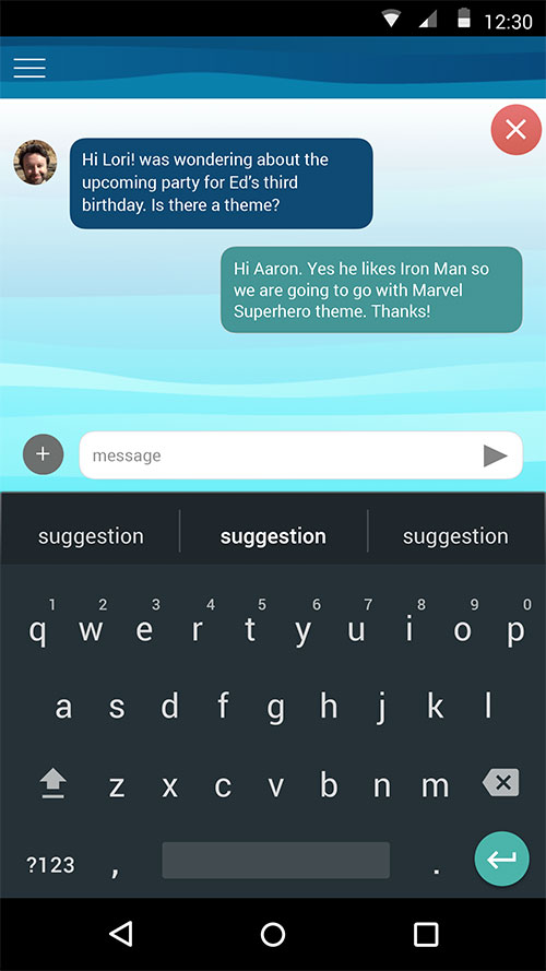
Messaging between family members was a core feature to facilitate communication about financial matters.

Balance & Transactions made it easy to track money flow.
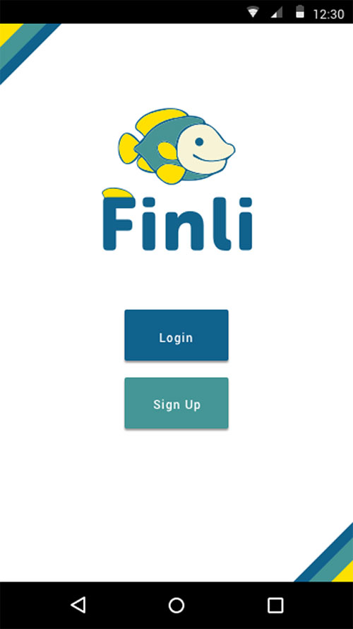
Begin sign in.

Expose sign in fields.
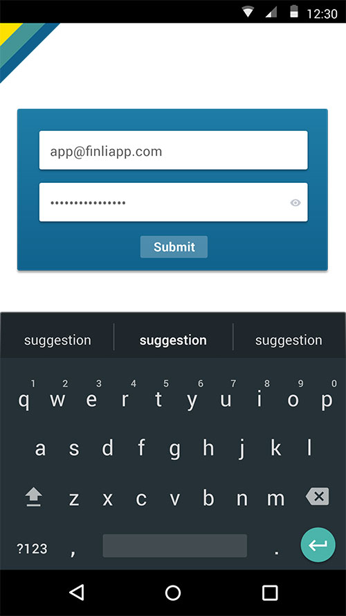
Masking sensitive password information.
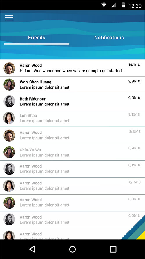
Homepage is Messaging with the default view of "Friends" selected.
Clicking into a particular conversation among friends.
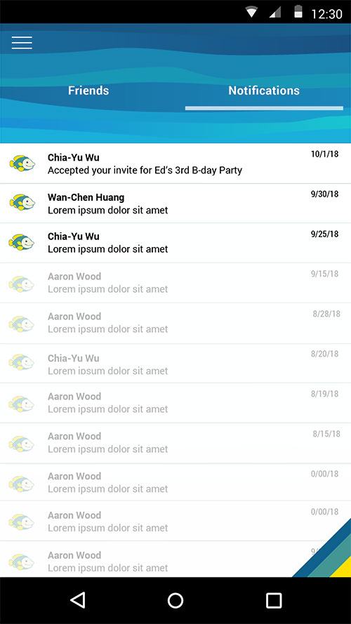
Notifications - this would likely end up being confirmation of money movements but the founder insisted on seeing events confirmation messaging. Events management was a feature that was discussed for MVP but taken off the list, as that could easily blow scope wide open.

Nav Menu animates in from the left on menu icon click, and contains some future state features that the founder insisted on seeing. I was happy to accommodate these requests despite the fact that some of these nav items wouldn't exist for MVP.

Circles - view of first child.

Circles - view of second child after arrow click.
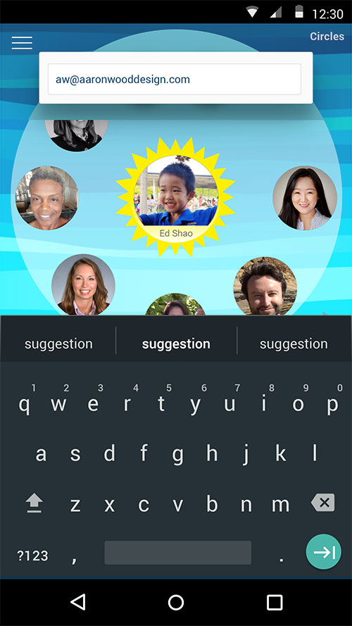
Inviting a user to the Circle (and application) through email.

Confimation of email invite.
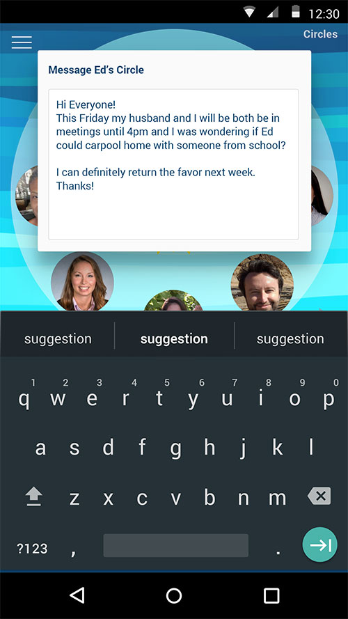
Messaging Ed's whole circle.
Final Screens and Handoff
The founder had a fixed UX design budget to get to MVP development. So as I wrapped up the last few screens, I left her with several protoype flows and several annotated designs to make development work go smoothly.
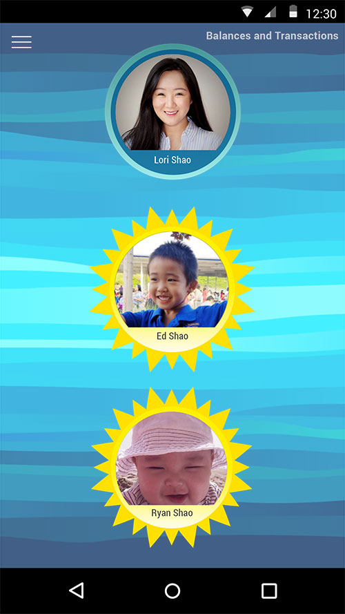
After clicking "Balances and Transactions" from the nav menu, you see which "Circles" roll up to a parent user who can send and receive money on behalf of their children.
Transaction view for one user with dynamic fields represented using underscores.
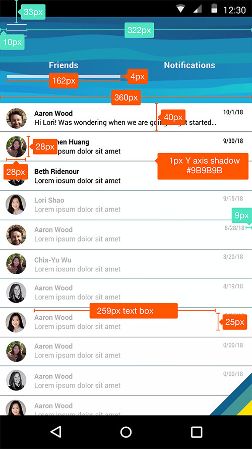
Annotated handoff for the Messaging screen of Finli.
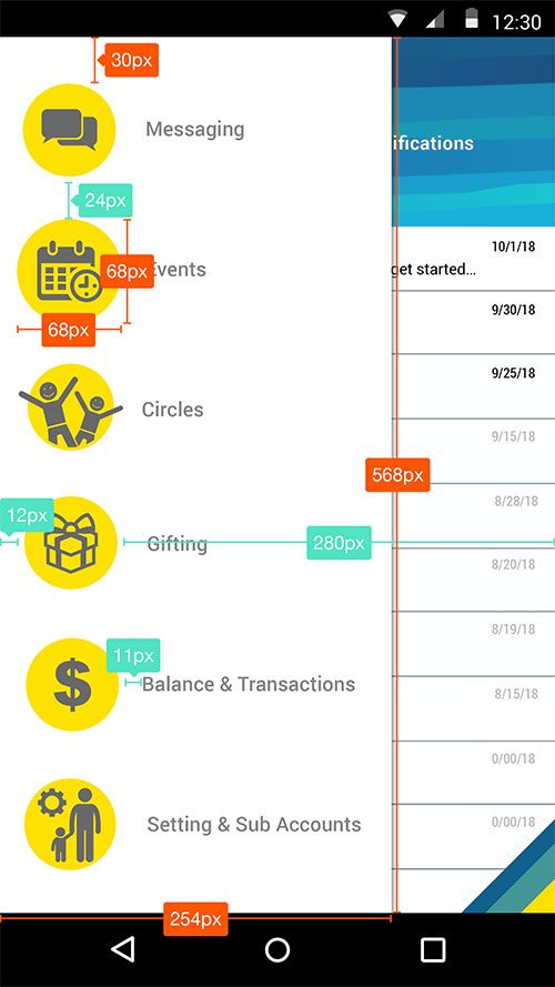
Annotated handoff for the Nav Menu.
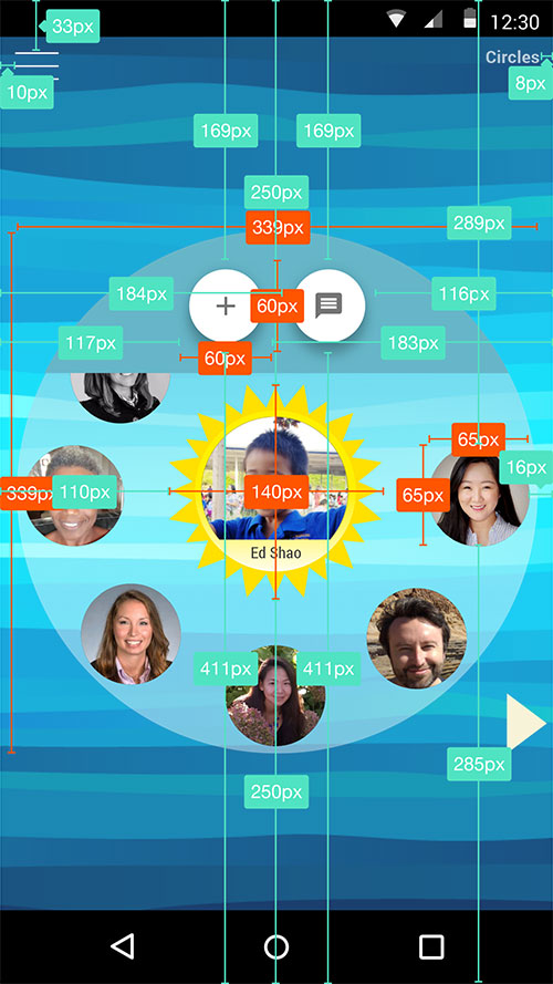
Annotated handoff for Circle feature.
Let's Work Together!
I'm passionate about creating meaningful design solutions that drive business results. Let's discuss how I can help bring your product vision to life.